If you haven't already heard, Google released an algorithm update in April that gives preference in mobile search rankings to sites that are mobile-friendly. If you haven't already checked to see if your site is mobile friendly you'll want to go to Google's Mobile-Friendly Test page.
The report will tell you what you need to fix. In most cases if your site is not responsive or a mobile m.website.com it will say it is not mobile friendly.
Some examples it may give you as to why web design is not mobile-friendly are that the text is too small to read or the links are too close together. If the text is too small the user will have to pinch to zoom which doesn't provide the best user experience. If links are too close then the user may accidentally click the wrong link and become frustrated and leave your site.
Google wants to give the user the best experience which is why these factors are huge in becoming mobile-friendly.
How mobilegeddon affected your website design
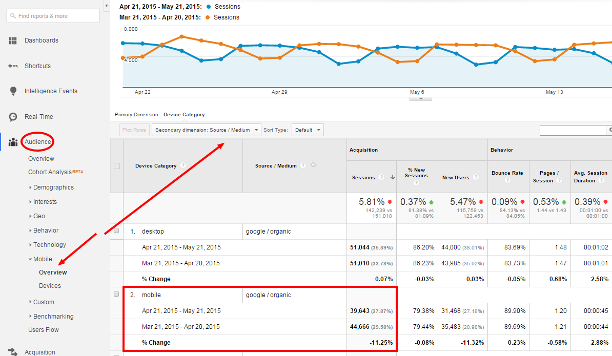
A lot of businesses want to know how Mobilegeddon affected their website design. A good way to tell besides looking at rankings is to view how your mobile traffic changed in Google Analytics after the April 21st update.
- Login to Google Analytics.
- In the left-pane navigation, select Audience->Mobile->Overview.
- Go to the date picker in the upper right-hand side. Set the date range from 4/21/15 to 5/21/15.
- Check the “Compare to” checkbox and select previous period and click "Apply". This will set the comparison date to the last 30 days.
- Select the “Secondary Dimension” dropdown and type in “Source/Medium” to break down the traffic segment.
- Compare how the performance is for Mobile in the Device Category column and Google / Organic under Source/Medium.
What mobile devices are viewing your web design?
While you should optimize your site responsively to be best for most of the popular smartphones and mobile devices, it's hard to optimize your website design for every mobile device there is. In that case, you may want to see what mobile devices most frequently visit your site.
To see the mobile traffic for the mobile devices coming to your site follow the same steps as above but in the left-pane navigation, select Audience->Mobile->Devices as you see below:
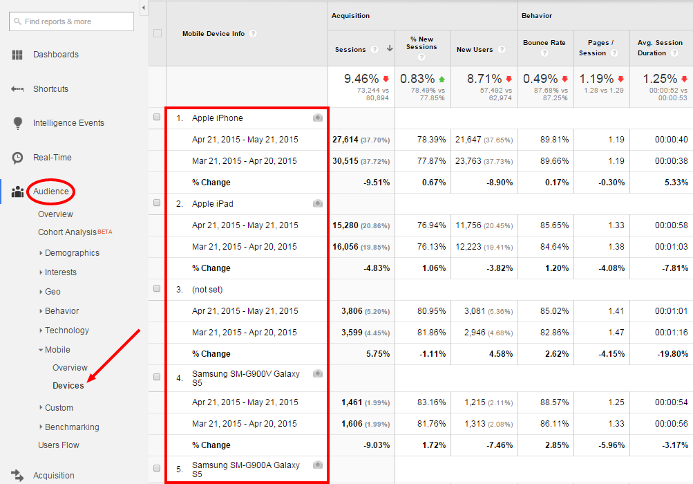
You will want to make sure that your website design is optimized for all of these mobile devices visiting your site as well as a lot of the newer phones as their resolution continues to get better as technology improves.
If you notice a big change like in this example and your website design is not mobile-friendly, which this was not, then you will definitely want to make your website responsive. As you can see it can result in a pretty big hit in mobile traffic, which no business wants to see.
Let us know if you need help making your site mobile-friendly or if you have any questions about your website. Our website design company is in Lancaster and focuses on helping small businesses with digital marketing services.