A mobile-friendly website design is no longer an option; it's a requirement. This isn't new - we've known for years that more and more people are using mobile devices to browse and search online. Google has long been pushing people to adopt mobile-friendly web design. But in 2020, we need to go beyond simply mobile-friendly and switch to mobile-first thinking.
Why You Need a Mobile-Friendly Website design
What you already know
Mobile-friendly web design has been a major factor ever since "Mobilegeddon." In April 2015, Google released a major update to their search algorithm that gave a ranking boost to mobile-friendly website design. The algorithm made it very clear: either your website design was mobile-friendly, or it was not. There was no in-between.

Source: Google Webmaster Blog
Even back then, Google made people realize that mobile web design was important, and they could not afford to ignore it.
Mobile-first indexing
Back in 2018, Google first announced that they were taking mobile-friendly design to the next level. It's called mobile-first indexing. As of July 2019, all new websites are subject to mobile-first indexing.
What does this mean? Desktops are no longer top dog when it comes to search. In fact, 61% of Google search traffic comes from mobile devices. And with voice search on the rise, expect desktop traffic to continue to drop.
To reflect this trend, Google changed the way it collects information from websites. Historically, Google has used the desktop version of your website design and then boosted your mobile ranking if it finds a mobile web design version. Now, they are starting their index with the mobile version. They will still crawl your desktop version, if necessary, but only if you don't have a mobile-friendly website design.
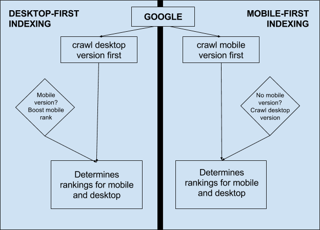
So what does all this mean? If all of your content is already optimized for mobile, or you have a responsive website design, you shouldn't need to worry - both versions of your website design have the same information, and Google will continue to index it.
However, some website designs have stripped-down mobile versions that contain a limited amount of information. These sites may suffer lower rankings in the future, since Google will prioritize the sparser mobile content.
Overall, Google is encouraging a shift in the way we think about website design. Many businesses focus only on how their web design looks on a desktop. Mobile web design becomes an afterthought. Google wants us to see the mobile version as the primary version of a website design.
Now that you know why a mobile-friendly website design is important, let's look at ways to optimize your site for mobile.
Related Reading: The Business Owner's Guide to Designing a Website For Your Business
How to Make Your Website design Mobile-Friendly
1. Make it responsive
Responsive web design means your website adapts to fit whatever device someone is using. Between desktops, laptops, phone, tablets, and more, there are tons of different screen sizes out there. Responsive website design uses flexible layouts that will look good on any size device.

A responsive website design is a great mobile-friendly option because it includes all of your website content, regardless of what device someone's using. It just displays it differently. It's great for web designers too, because they can focus on providing a great mobile experience without designing a whole separate website.
2. Include the same content on your mobile website design as your desktop website design
Again, because Google is now looking at mobile as the primary version of your website design, your mobile site must have all of your content.
In the early days of mobile design, web designers and web developers often created separate mobile sites, or m.dot sites (for example: m.company.com instead of www.company.com). Because the desktop website design was slow and cumbersome on mobile devices, m.dot sites were often stripped-down versions, with simplified content and limited navigation. Have you ever been browsing a website on your smartphone and seen a "View Full Website" option? That's a sign of a separate mobile website design.
With mobile-first indexing, you don't want Google looking at a site that only has a fraction of your content. Make sure that your mobile website design has all the same information, including text, images, and videos. This also includes the back-end stuff like meta data, alt tags, and structured data. If you do have a stripped down mobile site, now is the time to consider a switch to responsive web design.
3. Optimize it for speed on mobile
Google also announced that as of July 2018, "page speed will be a ranking factor for mobile searches." And, since Google is now prioritizing your mobile content, that means that slow pages could affect your rankings for both mobile and desktop searches.
Google knows that page speeds matters. A large percentage of users will abandon (bounce) off pages that take too long to load. This is especially true on mobile devices, since cellular data networks are typically slower and less stable than a wired desktop connection.
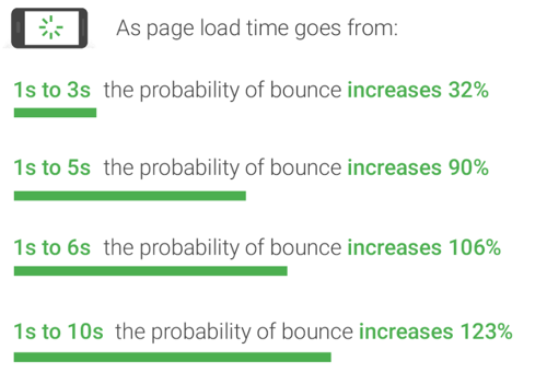
So a mobile-friendly website design needs to be optimized for speed on mobile devices. That means keeping your website design and coding slim and efficient. There's a lot of technical work that goes into that, but the goal is to make sure your site isn't greedily eating into customers' cellular data plan.
Check how your web pages are performing with Google's free PageSpeed Insights tool.
4. Ensure text is large and readable
Smartphones have small screens, but high resolutions. So if you try to display the exact same thing from your desktop to your phone, it's going to get REALLY tiny. That's why responsive web designs make text bigger - so it's legible on small screens.
Take a look at your website design on your phone, and check that the text is large enough to read without zooming in. Also make sure that the page fits the screen, so you don't have to scroll sideways to read lines of text.
5. Ensure buttons are clear and easy to click
Like text, buttons should be large and easy to see on mobile devices. Give them plenty of space too, so users aren't accidentally clicking on the wrong thing. It's incredibly frustrating when you have to use the tip of a pinky finger to click on something because the links and buttons on a website design are too close together.
6. Make phone numbers clickable
When people are on the go, they want to be able to find information quickly and easily, especially your contact information. If your phone number isn't clickable, someone browsing on a smartphone would have to remember the number or switch back and forth to their keypad. What a pain!
7. Make navigation obvious and easy to use
 Regardless of whether they're browsing on desktop or mobile, your visitors shouldn't have to hunt for your website's navigation menu. On mobile devices, people typically look for it on the top or bottom of the screen. To preserve precious screen space, many website designs also use a hamburger menu, which is reasonably well-recognized.
Keep your navigation as simple as possible by using clear language to describe your main categories, and try not to overwhelm your visitors with too many choices. If your navigation is too large, think about re-organizing your site structure, or at least consolidating the choices so they don't all show at once. Simplifying your site for mobile can actually lead to a more concise site overall that provides a better experience on desktop too.
Is Your Website design Mobile-Friendly?
To check, test it out using Google's Mobile-Friendly Test. If your website design isn't mobile friendly, you definitely want to start planning a responsive redesign of your website design.
If it is, that's great, but make sure you're prepared for the new mobile-first approach too. When you're thinking about your website design, think about providing a great experience for the person on a mobile device first, because that's where more and more of your customers are spending their time.
If you need help making your website design mobile-friendly, our web design company offers website design and development services and we are happy to assist in making your website design accessible for mobile. We're always happy to help!

This post was originally published in April, 2018 and has been updated with the latest information on mobile-friendly web design.