Your small business website design is like a storefront for your business. It's often one of the first things a prospective customer sees, so it's a powerful tool to make a good early impression. An effective website design attracts visitors and draws them in deeper, so they want to learn more and ultimately become your customers. A poorly designed or outdated web design can do the exact opposite.
Is your small business website design creating the best impression possible?
Here are some simple tips and tools you can use to evaluate your website design and determine if you're putting the best foot forward for your business. In the post below, we'll go into detail on design, content, user experience, and technical elements.
Looking to improve your website design? Check out our ultimate guide:
>>The Business Owner's Guide to Designing a Website for Your Business
For the TL;DR version, check out this video:
Design/Visual Elements
Website design matters. Users will judge your website based on how it looks, and visitors will actually leave if your content and layout is unattractive. What's more, one of the first things we hear when someone is considering a redesign is, "I don't like the way my website looks."
Here are a few signs your website design may be in need of a face-lift:
1. It's visually complicated
It only takes 50 milliseconds (0.05 seconds) for visitors to form a first impression of your website. Before they read a single word on a page, they're judging your site based on look and feel.
In that lightning-fast moment, the simpler the better. Visitors need to know instantaneously where they should look, but if a page is too complex, their eyes don't know where to go. Things like structure, color, spacing, and font help identify what's important.
Take this example from Skinnyties.com:
Before:
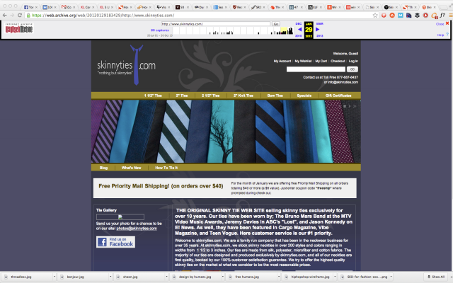
Here, you don't know what to look at. There's no bold text headline to draw your eyes, the navigation bar gets lost, and there are so many colors, it's hard to figure out that they're even selling ties.
After:
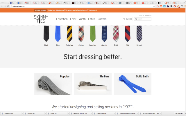
This simplified white layout makes everything feel more "open" and emphasizes the product. Your eyes are immediately drawn to the simple text headline, and there are three obvious buttons below to continue your search.
Which site would you prefer to shop on? The simple winner is clear.
2. Low-quality graphics
In the age of 12-megapixel (and counting!) smartphone cameras, it's easy to take high-quality, high-resolution photos. If you're not a photographer, stock photo websites offer a multitude of options. There are even many quality free stock photo sites if you're budget-crunched.
Check your website design for low quality, fuzzy, or stretched images. They are a dead giveaway that your site is outdated.
3. Overuse of stock photography
 Before you go crazy with stock photography, remember that even the best stock photos have their limits. And the worst ones... well, we've all seen these cheesy photos of the overly-happy call center workers. A small business web design full of smiling models and perfectly choreographed office environments lacks authenticity, and it distances visitors from your real people, your real products, and your real vision.
Plus, there's always a chance that your competitors will use the exact same imagery. Just look at this story about the Everywhere Girl, who posed for a stock photo shoot and ended up in advertisements for Dell, Microsoft, Greyhound Bus Lines, the U.S. Navy, and more.
Invest in your own photography, because there's no substitute for your genuine imagery.
4. It doesn't reflect your current brand
Your website design should always represent the best and most current expression of your company's brand. If you updated your logo, changed your colors, or altered the styling of any of your materials, your website should look the same. Your brand helps create personality and differentiation for your business, but inconsistency between your website and other materials can hurt your credibility.
Imagine a prospective customer learning about your business on your website, but when you send them an email or mail them a brochure, it looks completely different. Suddenly, they're not sure if you're even the same company, and they don't trust you. Make sure your website's branding is current and consistent.
5. It looks like it was built in 1997
There's nothing wrong with 1997 (after all, that's when we started!), but the Internet has changed a lot since then. Early website designs served as simple informational resources and lacked the tools we have today in terms of design options. Let's be frank: they were ugly.
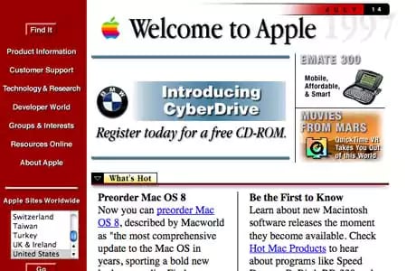
Since then, website designs have evolved into a highly sophisticated communication tools, and users expect an attractive web design that delivers a much more robust experience. Apple's website design probably worked great in the 1990's, but today's user would dismiss it in a heartbeat. If your website design still looks like Apple's did, it's time for a change.
CONTENT
6. Incorrect or outdated information, especially contact information
According to a study from KoMarketing, 86% of visitors to your websites look for information on your products or services and 65% of visitors want to see your contact information. That's a lot of potential customers you're misinforming if your website content isn't up to date.
Your contact information is especially critical, not only because your customers are looking for it, but because search engines are too. Google's local search results rely heavily on your business name, address, and phone number. If there are errors or inconsistencies in your contact information, it may jeopardize your SEO rankings.
Obviously, you should update your website design if your offices moved or your have a new product, but there are some other less-obvious ways that your information may be outdated. References to specific events, dates, or statistics are easy to overlook, but can be a big sign that your content is aging. Or, perhaps you're in a fast-moving industry that is constantly evolving with new trends and technologies. If the content on your website design isn't up-to-date with the latest advancements in your industry, your customers may doubt your expertise.
7. It contains unused pages or features
You know that news page where you uploaded three articles in 2011, and you haven't touched it since? The information may still be correct, but pages collecting digital cobwebs are an obvious sign that your website needs some attention.
Don't worry, though, you're not alone. Even the NBA has pages collecting dust, like the one below, dedicated to Michael Jordan. The season highlights that stop in 1998 are a dead giveaway!
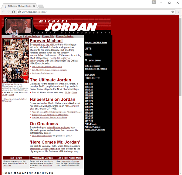
Unused pages can also hinder user navigation, making it harder for visitors to quickly find current information. Simplicity is key to effective navigation, and outdated pages only divert traffic away from more important areas of your website.
8. It hasn't been updated in forever
 Although there is no definite rule for how long a website design can last, three years is essentially forever in Internet terms. If you've barely touched your website in multiple years, it's likely reaching the end of its lifespan.
But rather than viewing a web design as a "design-it-and-forget it" thing, think of it more like a car: what makes both last longer is regular maintenance. Just like your car needs inspections, oil changes and tune-ups, a healthy website should be regularly changed and updated with fresh information, products, news releases, blog posts, and more.
Fresh content not only keeps your visitors coming back, it can also boost your SEO rankings. Google has a "freshness factor" which affects rankings based on when a page was published, how often content changes and how substantial the changes are.
9. Your content doesn't grab attention
You may have heard that the average human has a shorter attention span than a goldfish (around 8 seconds). While that may be an over-generalization, research has still shown that you have a very short time to engage your web visitors.
Your content needs to give visitors a reason to stay on your website. The first step is to make sure your homepage, which is the primary landing page for your website, is drawing in your visitors. Your homepage should immediately answer a few basic questions for your visitors:
- What do you do?
- Why should I care?
- What do you want me to do next?
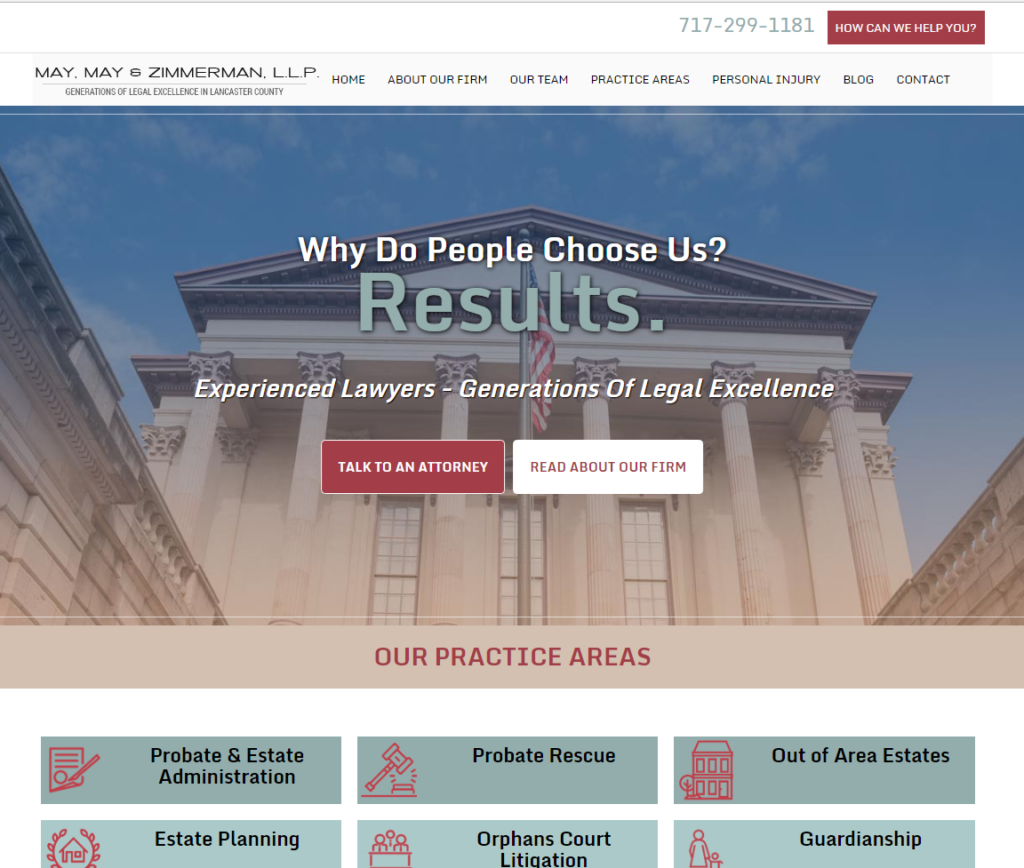
Take this example from one of our small business clients:
 Source: http://www.mmzlaw.com/
First, it's immediately obvious that this is a law firm, with references to experienced lawyers, the clear buttons under "Our Practice Areas," and main courthouse image. The header copy answers the "why should I care?" question by highlighting the firm's focus on results and their generations of experience. Lastly, the bold buttons tell visitors what they should be doing next - either reading more, or contacting an attorney.
10. Missing or unclear calls to action
Your small business website design should be generating results for your business: engaged followers, leads, and sales, but it isn't going to drive anything if your visitors don't know what to do next. A clear call to action (CTA) tells visitors the next step to take in your sales process, which might be signing up for a newsletter, downloading a report, attending an event, or requesting a consultation.

Whatever the CTA, make sure it visually grabs the visitor's attention. Boldly colored buttons help draw attention and clicks. Next, craft a simple, compelling offer that demonstrates a clear value. Here, "End My Scheduling Hassles" identifies a clear problem and promises a result. Finally, include supporting copy around the button to reinforce value or counter objections. This may not always be required, but the bigger the "ask" in the CTA (for instance, anything that requires a purchase), the more incentive you'll need to provide before users click.
USER EXPERIENCE
11. It's not mobile-friendly
Mobile devices account for 51% of organic search traffic in the U.S., and that number is growing. With over half of search traffic coming from mobile devices, a mobile-friendly website design is no longer an option; it's a requirement.
Not only do users expect an optimized mobile experience, Google now indexes mobile sites first and penalizes websites that are not mobile-friendly. While companies sometimes build separate mobile sites, most use responsive web design, where content adapts to the size of the screen being used.
Is your website design mobile-friendly? If you're not sure, check with Google's handy free tool.
12. Slow load times
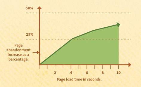
Seconds count. We've all been frustrated by slow web pages, and many users won't wait longer than a few seconds for a web page to load. How fast should your pages load? Simple answer: as fast as possible. According to Kissmetrics, even a one second delay can mean a 7% reduction in conversions. Take a look at their infographic below, and you'll see that up to 25% of users were abandoning a page with only a four second load time, and it gets worse from there.
Think your pages are loading fast enough? Test your page speed here.
13. Visitors aren't staying
Once visitors are on your site, you want them to stay. The last thing you want is to drive them away due to a bad experience. One way to measure this is to look at your bounce rate, which is the percentage of users who visit a web page and leave without looking at any other pages (in other words, single-page visits).
The lower the bounce rate, the better, but typical bounce rates vary widely depending on the industry and type of page. For example, a blog site may have a 70-90% bounce rate, because visitors rarely read more than one article at at time. Meanwhile, a service site typically has a much lower 10-30% bounce rate, because visitors need to visit multiple pages to understand the service in depth.
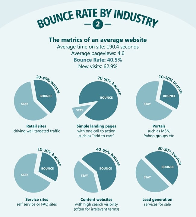
Google Analytics is the easiest way to check your bounce rate, so make sure it is properly configured on your website. Google gives a site-wide average bounce rate, but check bounce rates for individual pages too. Start with your homepage first, then drill down into your most popular pages.
14. Broken pages & links

"404 Error: Page Not Found." You've seen this type of page when you're browsing a website and you click on a page or a link that doesn't work. Broken links are typically caused by moving or renaming a page on your site, or linking to other pages, images, or videos that have moved (or no longer even exist).
In addition to frustrating users, broken links stop search engines from crawling and indexing your site, which can hurt your rankings. So it's important to constantly police your site for broken links. Try a tool like dead link checker.
15. Difficult navigation
Imagine driving in a crowded city with hidden street signs, no lane markings, and stop lights that don't work. Chaos. That's what your website is like without clear navigation.
What makes a website design a virtual traffic jam?
First, a hidden navigation bar. When you're driving, you know where to look to find a stop sign or traffic light. Similarly, visitors expect your navigation bar to be on either the top of your site, or the left sidebar. Don't make them search for it.
Navigation with vague labels or too many choices also complicates the user experience. For example, a navigation link called "Discover," could mean a lot of things: it could be information about the company, new product offerings or an inspirational blog. Meanwhile, e-commerce website designs are especially are prone to listing tons of sub-categories for products, giving users so many choices it's confusing.
Lastly, don't leave out pages visitors expect to see, like About, Products/Services, and a Contact page. It may seem dull, but when it comes to navigation, stick to standards and best practices; navigation isn't the place to be clever.
TECHNICAL CONSIDERATIONS
16. You don't show up in search results
This is a big one. There are a million reasons why you might not be appearing in search engines. Your website design might not be optimized with appropriate tags and keywords to accommodate SEO. Perhaps your local listings are incomplete or incorrect, excluding you from Google's local search results. Maybe you're having trouble attracting quality inbound links to your website content.
The bottom line is that if you aren't at the top of the rankings, you're missing out on enormous potential traffic. The top three results on a search engine results page capture the majority of clicks, with the top position taking almost 1/3 of all clicks, according to this study from Advanced Web Ranking.
Use a free tool like Rankscanner to help identify your search engine rankings for your key search terms. Search engine optimization is a complex and ever-changing puzzle, so if you're struggling to rank well, consider talking to an SEO company like ours.
17. The URL structure is too complex
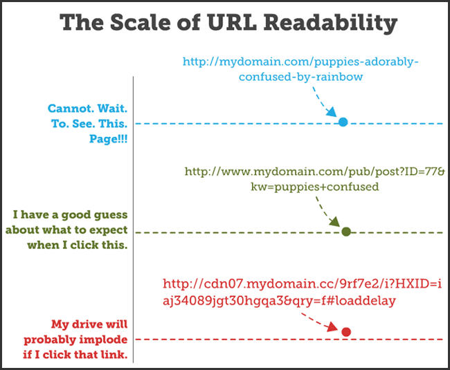
URLs help your visitors identify how your site is organized and what content they should expect on a page. While it's good to have keywords in your URLs, design them so they make sense for human beings first, not search engines.
The Infographic below shows the difference between an easy-to-read URL and one that will drive users away.
 Source: Moz
Rule of thumb: keep your URLs short and simple. Also, use hyphens to separate words, rather than plus signs, underscores or spaces.
18. It still has Flash elements
![]() Adobe Flash is a software that was extremely popular on the early web for running videos, animations, and games. Due to security risks, slow performance, and more, Flash is no longer supported on most mobile devices, and many browsers are phasing it out.
Adobe Flash is a software that was extremely popular on the early web for running videos, animations, and games. Due to security risks, slow performance, and more, Flash is no longer supported on most mobile devices, and many browsers are phasing it out.
Notably, Apple was one of the first companies to move away from Flash. Steve Jobs wrote a highly controversial letter on the subject back in 2010, citing reasons why the iPhone, iPad and other devices would not support Flash. Most modern websites are adopting HTML5 and other open standards that do not rely on Adobe's proprietary software.
So if you still have Flash elements on your site, it's definitely time for a web design update. Here's a tool to check for Flash.
19. No social links
In today's highly social media-driven world, social links offer another way for your customers to easily interact with you and share your content. If you have active social media profiles on Facebook, LinkedIn, Twitter, etc., then you should consider including social follow buttons on your homepage and social sharing buttons on your blog posts. Typically, you should put them at the top of the page, the bottom of a post or along the left-hand side for best effect.
IS IT TIME?
Ultimately, your small business website design is probably doing some of these things well and some of them not so well. So when is it really time to pull the trigger to make updates?
The good news is, many of these updates can be made to an existing web design as part of a regular, ongoing maintenance process. When considering a larger website design refresh, ask yourself two questions:
- Am I proud of my current website design?
- Is it generating results for my business?
If you can't definitively answer "yes" to those questions, it's definitely time for a website design update for your small business. Our website design company offers affordable small business websites, without any hassle to you. Make sure to reach out regarding any of your website design needs.

