Website design has evolved a great deal over the last decade. Social media and SEO have changed the way online companies do business, and challenged web designers to keep up with new trends.
Successful website design accommodates the changing needs of their clients, from what they want to what they’re looking for. Tailoring a website’s content to what customers respond to, creating responsive designs that allow for mobile browsing—these things have changed the landscape of digital marketing. Why are these changes taking place? Because people aren’t browsing or shopping the way they used to. Their habits have changed.
Our ten-year retrospective looks on the evolution of website design at three of the most popular sites and how they’ve changed since 2005, for better or for worse.
MSN website design through the years
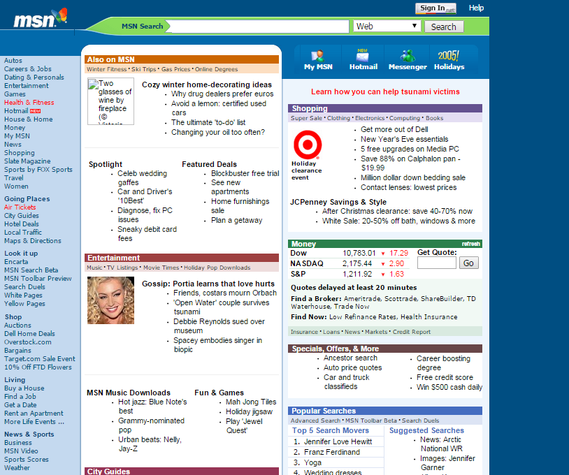
2005
Microsoft owns and operates msn, a web portal, which offers other related services and apps for the Windows OS and mobile devices. From the 2005 screenshot, you can tell that it was very msn-centric. It was basically a portal to itself and related msn/Windows services, and offered sparse content to interest visitors to the homepage.
Very much a web portal, the 2005 msn did little to ingratiate itself to visitors. The same can’t be said for its current incarnation, however.
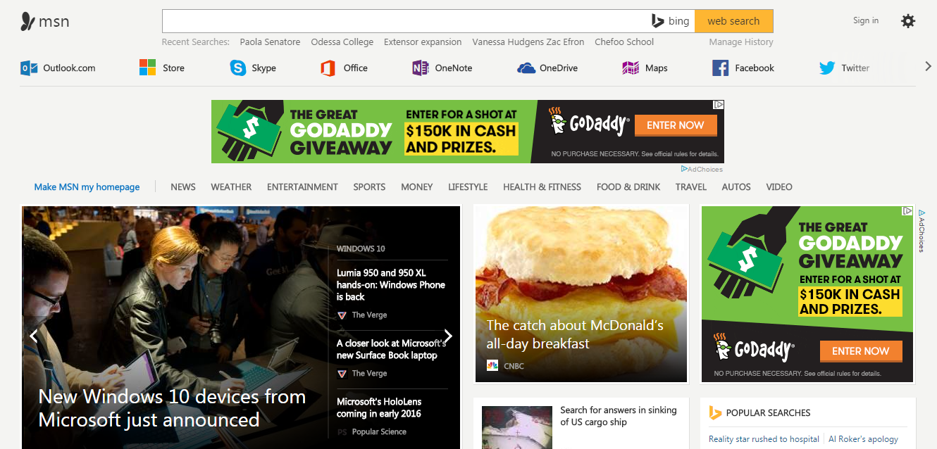
MSN currently serves as a hub for news, social media, and productivity. At the top of the homepage, users can choose between the search engine, being productive, or visiting their favorite social media websites. What follows is pure content. Trending videos and stories take the lead, followed by a plethora of categories designed to provide something for everyone.
MSN has worked to market itself as a place users can get their daily dose of world news, celebrity stories, and more. Even the quirky, colorful logo takes itself more seriously now as a monochrome, newspaper-worthy graphic.
eBay website design through the years
2005
2015
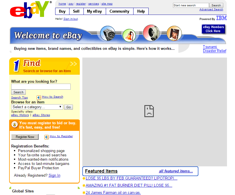
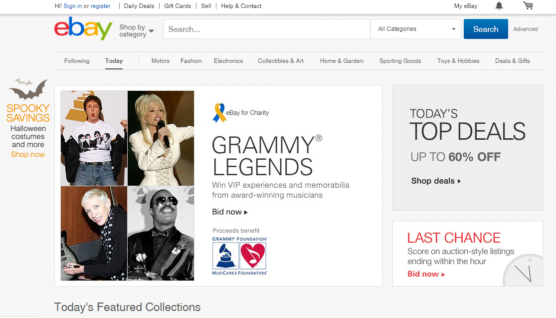
Most people know about eBay, which should speak to its popularity. The website design that paved the way for buying and selling goods online has made some drastic changes to its approach to e-commerce over the last ten years. One look at their site then and now says as much.
In 2005, they were focused on basic functionality—selling, buying, and browsing current eBay listings. Content was minimal if not non-existent. There was nothing to engage or incentivize visitors to use the website or its services. A funky logo spoke to a niche service as if that one element alone was enough to rack up users.
Now, eBay focuses on turning its visitors into customers. The current site screams e-commerce and it addresses what users may be looking for. Its themed, content-driven homepage makes shopping easy by letting visitors sift through featured collections and highlighting current deals. They’ve prioritized visual aids and content to keep users sticking around.
Yahoo! website design through the years
2005
2015
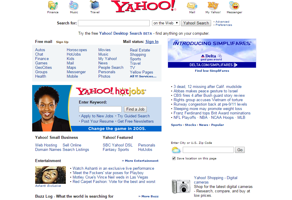
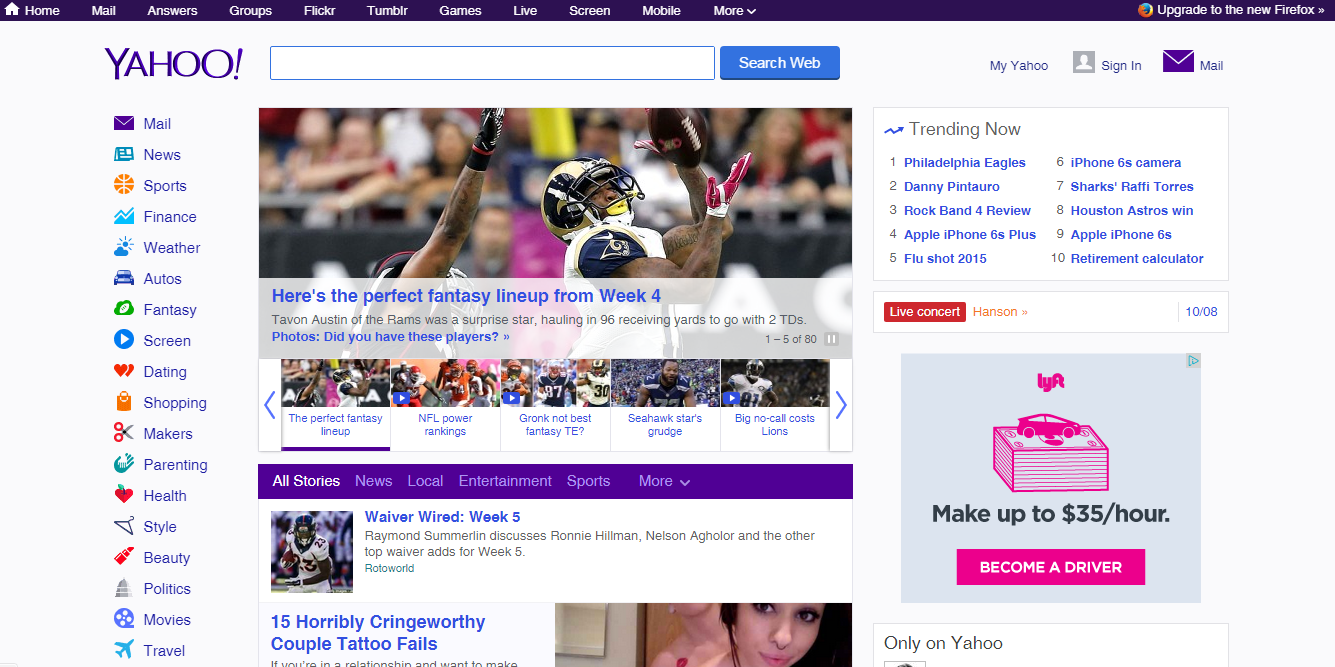
Another website design with a former zany-font for their logo, Yahoo,has made significant changes to their homepage over the years. The interesting thing lies in how close the 2005 and 2015 websites are in design. The logo color changed from red to purple, but for the most part, Yahoo!—an established web portal and email/messenger service—has kept in touch with its core purpose.
Of course, they’ve changed to suit the needs of users as far as social media and content are concerned. With a wider range of available front-page content, Yahoo’s website design can rank higher in search results. It’s no secret that content-rich websites rise to the top and Yahoo is a prime example.
From then to now...evolution of website design
It’s natural for businesses to evolve over time and as the customers change so must the companies hoping to succeed. As new trends come and go, web designers are better able to design websites that focus on the needs of each visitor.
Visual aids such as images and clearer logos draw the eye in, while categories of fresh content mimicking the layout of newspapers keep users engaged. The addition of social media links then allow users to have everything they want in a single location. With enhanced online shopping carts, e-commerce website designs flourish by making every transaction quick and hassle-free.
Marketing in this digital world has become straightforward, but standing out from the crowd is anything but simple. With so many websites providing the same amenities and scope of content, it comes down to adapting.
Curious to see how we’ve changed since 2005? Visit us ten years ago here. If you’re looking to bring your website design into the modern world and want to learn more, check out our Business Owner's Guide to Designing a Website. You can also contact our web design company for web design services that will help you get a successful, modern website design for your business.
