Video Transcription:
My website's a little old, but it's still good enough, right?
If it's been a few years since you've updated your website design. You know it's not new, but you don't really want to go through the hassle of a redesign. Look, I get it: your web design often isn't the loudest squeaky wheel. But if your website design is old outdated or ugly, it's hurting your business. To find out how, keep watching.
Hi, I'm Tom Malesic, founder and President of EZMarketing, and you're watching Ask EZ. This is where small business owners go to get real answers to their marketing questions.
First Impressions Matter
We all know that first impressions matter. Like your mom always said, 'you only get one chance to make a good first impression'.
How your website looks makes a huge difference in whether someone decides to trust you with their business or not. It only takes a second for a visitor to form an opinion about your website design and 75% of people admit to making a judgment about a website's credibility solely based on the design.
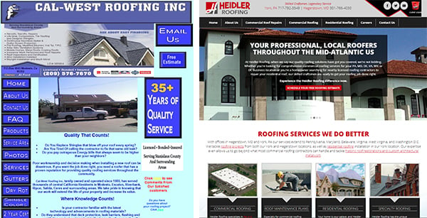
So here's an example:
Who would you rather do business with?

An ugly website design is embarrassing and makes you seem untrustworthy. It's really important to invest in a professionally-designed website so that you can make a really good first impression.
User Experience Matters
Also the user experience REALLY does matter.
Your website design should be easy for people to use and find information. 88% of people are less likely to return to a website after a bad experience. Lots of things can cause a bad user experience things like cluttered design, too many things in your navigation, or that it's just not mobile-friendly.
So here's why that's a problem:
1. Confusing Your Customers
First, you're confusing your customers. When customers come to your website, they want to know:
- What you do
- How you can help them
- What they should do next
If your web design has a bad user experience they won't be able to figure that out quickly. 46% of online shoppers list not being able to tell what the company does as the reason for leaving the site.
A bad user experience creates confusion and remember: a confused customer doesn't buy!
2. Frustrating Your Customers
And second, you're frustrating your customers. So even worse, people may know what you offer, but your website design is frustrating them so much they don't want to buy from you.
The easiest way to frustrate your customers is to have a site that's not mobile-friendly or is loading slowly. 40% of people say they leave the site immediately if it takes more than 3 seconds to load.
We all know that people naturally choose the path of least resistance. If you have frustrations and barriers they're gonna go somewhere else.
An ugly website design isn't just good enough. It's embarrassing. It's making a bad impression. It's losing your business and costing you money! Get a great web design that you'll love and avoid the nightmare of choosing the wrong website developer. I invite you to download our Buyer's Guide so that you can avoid these common mistakes.
If you like this video don't forget to like and subscribe.

