It feels like déjà vu ... 13 years ago, the Philadelphia Eagles faced off against the New England Patriots in the Super Bowl. Seems very familiar. But even though Bill Belichick and Tom Brady are still around, many other things have changed since 2005 (besides the outcome). Website design is one of them.
2005 may not seem like that long ago, but when you look at web designs from the last decade, you'll see the difference. Let's take a look back at what Super Bowl hype looked like in 2005 vs. today.
NFL.com
2005
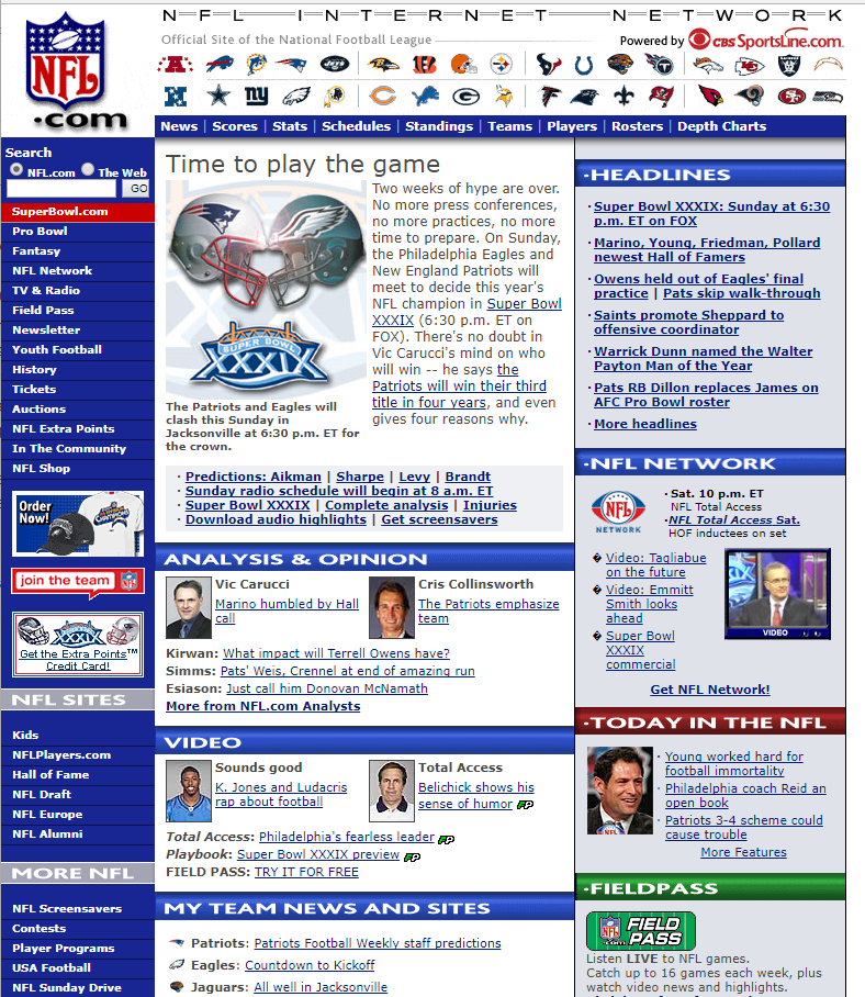
The first thing you probably notice about this site is text. Lots and lots of text. There are so many headlines and links on this page, you wouldn't know where to click. The three column layout, which was popular at the time, crams the page full of information, making it feel crowded and claustrophobic. Even worse, most of the text is the same size, so there's no visual heirarchy to tell your eyes where to look.
The result is that despite being mere days away from the Super Bowl, the graphic and story about the game get lost on the page.
2018
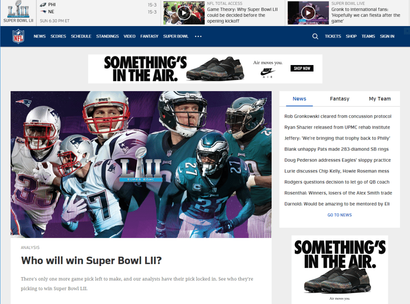
Take a look at the difference in 2018, just before the big game. Your eyes are immediately drawn to the hero image, which clearly highlights the two teams. You can practically feel the tension between quarterbacks Tom Brady and Nick Foles, adding to the hype for the game. Right below the image is the clear headline: "Who will win Super Bowl LII?" which directs you to the day's featured article.
Visually, the page breathes more too. There's plenty of links to keep avid football-followers busy, but most of them live in a clean, organized list on the right-hand sidebar, so they aren't overwhelming.
Finally, we can't ignore the Nike shoes all over the page. Like it or not, digital marketing is a fact of life today, and most major website designs are full of ads. It's no surprise that 87% of people say there are more ads than two years ago. Certainly they've gotten bolder since 2005.
>>Related Article: 13 Scary Advertising Statistics You Need to Know
Takeaways:
- Use bold, high quality imagery with your website design to help tell your story and draw attention to important features
- Create a visual hierarchy on your page with open space and larger font sizes, so users know where to look
Superbowl.com
2005
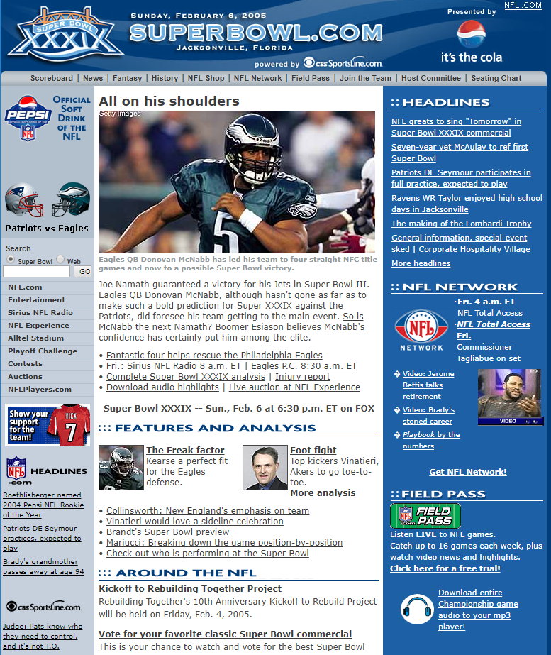
The NFL's dedicated Super Bowl site from 2005 suffers from many of the same issues as their main site. Once again, it's overcrowded, making it hard for users to decide what they should do next. The main image does at least draw your attention toward a main article, but is that what most visitors are looking for?
The big question a Super Bowl site should answer is: "when is the Super Bowl?" Only at the very top of the page do they mention the date of the event, and the actual time is nowhere to be found.
At least one thing hasn't changed since 2005: Pepsi remains the ubiquitous sponsor.
2018
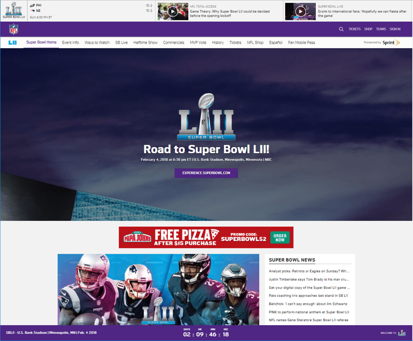
Now compare the 2018 Super Bowl website design. Stark contrast, right? Above the fold, you see only a single image and clear call-to-action: "Experience Super Bowl.com." The site makes it unmistakably clear what they want you to do next.
They also answer the most important questions most visitors have right off the bat. The date, time and location of the game are right in the middle of the screen. They even include a fun countdown timer to add to the hype (and help the people who can never remember what day it is). Even more, the first two links in the navigation bar are "Event Info" and "Ways to Watch." The NFL's goal is to get more people watching the Super Bowl, and their site is clearly geared toward that goal.
Takeaways:
- Think about your goals for your website design and create clear calls to action that drive the desired action
- Think about the common questions you're customers are asking, and what they're looking for when they come to your site. Make sure you answer those burning questions right away
Pepsi.com
2005
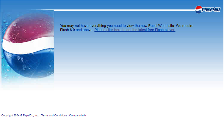
Since Pepsi and the NFL so often go together, we thought we'd take a look at their old website. Unfortunately, the archives couldn't provide much. Pepsi's old website design used Flash, a common technology at the time for displaying animated or moving elements. Flash suffers from many problems including security issues and slow performance, so it is obsolete at this point.
Unfortunately, some current sites still use Flash technology, despite the fact that it is not supported by many devices and browsers. If your site still uses Flash, it's time for an update.
2018
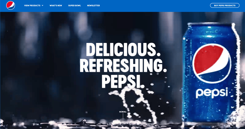
Pepsi's current website design still makes great use of motion (just without Flash). The video playing on the homepage highlights the product and makes you thirsty. They keep the page very clean, with a simple navigation menu and an invitation to scroll further down the page.
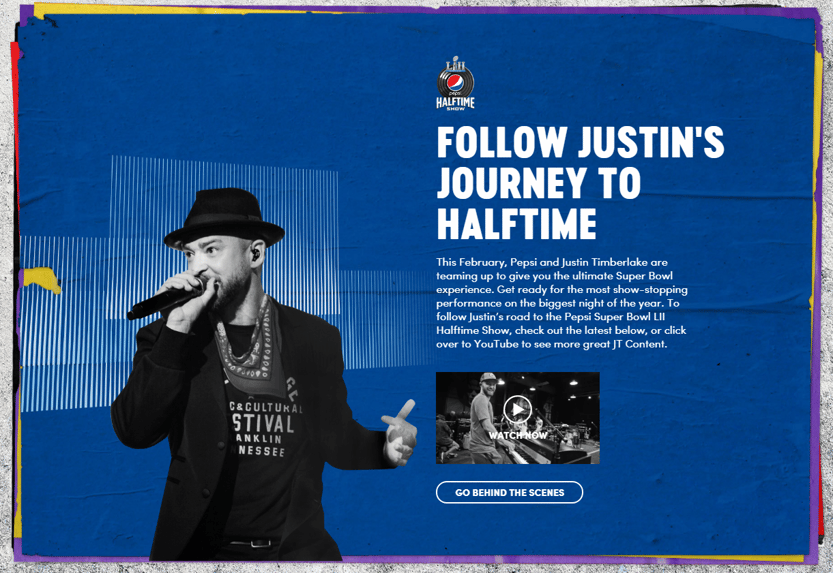
As the Super Bowl halftime sponsor, Pepsi included this behind-the-scenes peek further down their homepage. Justin Timberlake has nothing to do with selling soft drinks, but Pepsi knows that fans love getting a glimpse behind the curtain. They're glad to attach their brand to the halftime spectacle.
Takeaways:
- Harness the power of video and motion on your website design to add interest and excitement, just avoid using outdated technologies like Flash
- Enhance your brand by offering valuable content that your audience will love
Papajohns.com
2005
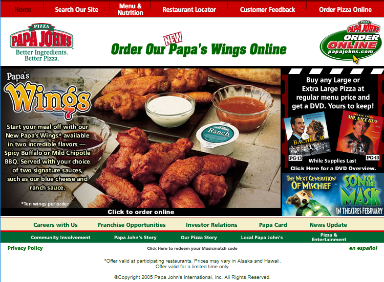
What else goes perfectly with the Super Bowl besides Pepsi? Try pizza and wings.
The Papa John's of 2005 is actually remarkably similar to its current self. The classic red logo and pictures of the latest game-day snacks dominate the page. Even back then, they clearly knew the power of online ordering. Their calls to action consistently direct customers to order online.
Unfortunately, Papa John's didn't take advantage of the Super Bowl hype. This screenshot is taken just before Super Bowl Sunday, yet there's no mention of game-day discounts or specials. Instead, we just see movie-related offers in the right sidebar that look especially out of place amidst the (admittedly Christmas-y) red and green theme of the rest of the site.
2018
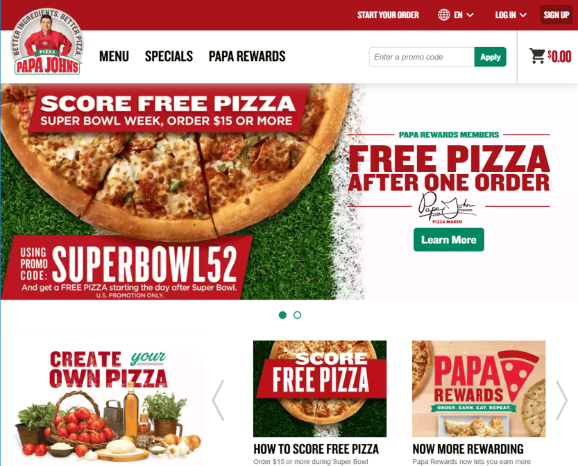
Papa John's modern website design captures the Super Bowl spirit with a prominent promo code and football-themed background. They even repeat the CTA for free Super Bowl pizza below the fold. They've also replaced the long-winded explanation of their wings with short, punchy headlines that are easy to take in at a glance.
Despite a similar color scheme to their 2005 site, Papa John's has also made plenty of visual tweaks to make the site more appealing. They toned down the Christmas theme, softening their harsh green into a more blueish-green. On their headlines, they also transitioned to a non-serif font, which looks more modern.
Takeaways:
- Be aware of current events . With the world as connected and social as it is, relevant, timely marketing is key
- Craft bold headlines. People lose interest fast, so they need concise information, not long-winded descriptions
- Consider your brand logo, colors, fonts, and styling carefully, and make sure they stay up-to-date with modern web design trends
The next time the Eagles and the Patriots face off, we'll have to compare websites again. In the meantime, congratulations to the Eagles, and if you missed them, don't forget to check out the amazing commercials!
If you are finding that your business is in need of a website redesign or just web design services in general, give our web design company a call or send us an email today.

