This Week's Question: I'm looking for ideas and inspiration for my website design. What are other small businesses doing?
Transcription:
I'm looking for ideas and inspiration for my website design. What are other small business owners doing? If you're not happy with your website, sometimes it's hard to put your finger on exactly what's wrong.
Maybe you just need a little bit of inspiration. Take a look at some examples and hopefully you'll be inspired!
Hi, I'm Tom Malesic, founder and President, of EZMarketing, a website design company in Lancaster, PA and you're watching Ask EZ. This is where small business owners go to get real answers to their marketing questions.
Dutchies Stoneworks Example
An example that might really inspire you is Dutchies Stoneworks. They're a masonry contractor who does backyard patios, fireplaces, outdoor kitchens, really, really, neat high-quality work. Their goal is to target high-end homeowners, who really want a wonderful backyard living experience.
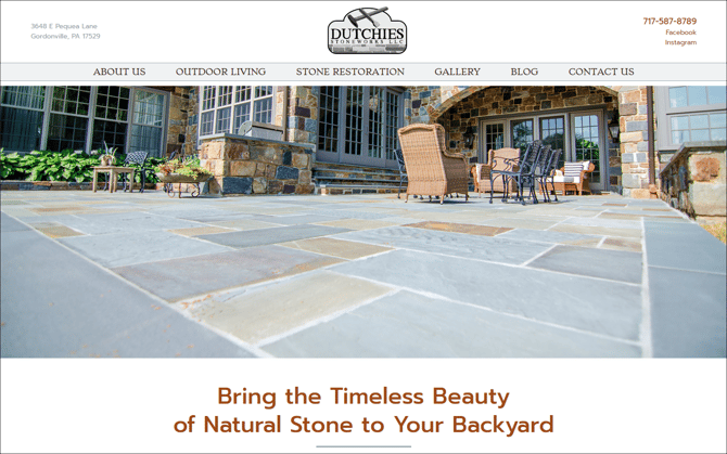
Imagery
So how do they do this? They focus on imagery. They have a beautiful project gallery that shows their finished work. You get to see the high-caliber work that they're going to do for you in your backyard. Think about it, a picture it's worth a thousand words.
On their service pages, we have large impact images, with then smaller detailed shots to show the different variations that you're going to experience when you become their customer.
Takeaways
Your takeaways from this example is that people love seeing your work. They love it much more than reading lots and lots of text. So invest in really high quality photographs, and you can make a huge difference on your website design.
Creative Packaging Solutions Example
My next example is Creative Packaging Solutions. They're a company that offers packaging automation and robotics solutions for the manufacturing industry. Often I hear from our B2B clients, they say things like listen, my business really isn't all that exciting or sexy. What can I do to have it still be really impactful and exciting to our customer?
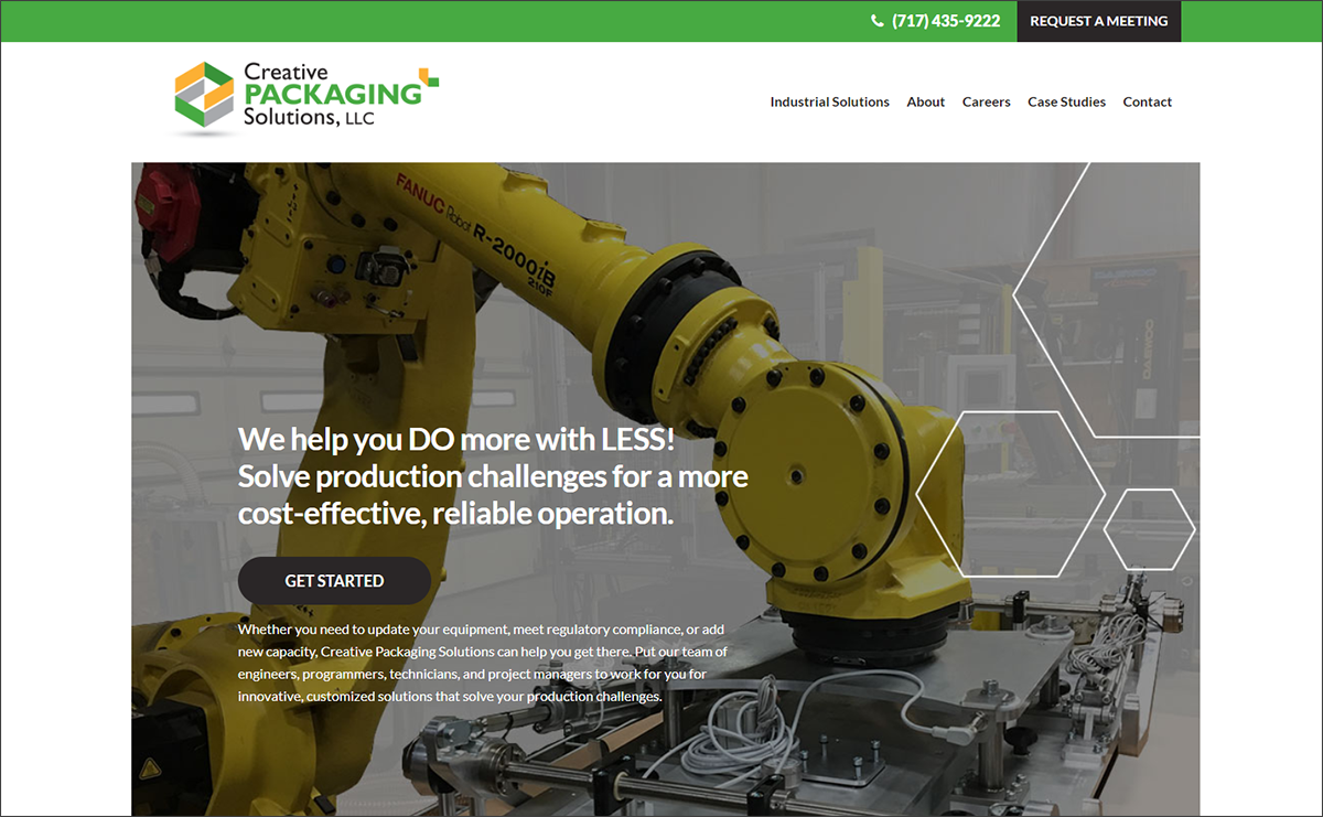
Great impact image
The trick on their homepage was to really give them a great impact image that grabbed your attention right away. Because packaging solutions by themselves might not sound cool and sexy, but robots certainly are really, really cool.
Keep your copy clean & clear
When you take a look at their copy, it's very clear, it's jargon free, and it tells you exactly what they do and how they help their customers. What we talked about is that you can do more with less, that we solve your challenges, that we can make this cost effective, and a reliable operation for you.
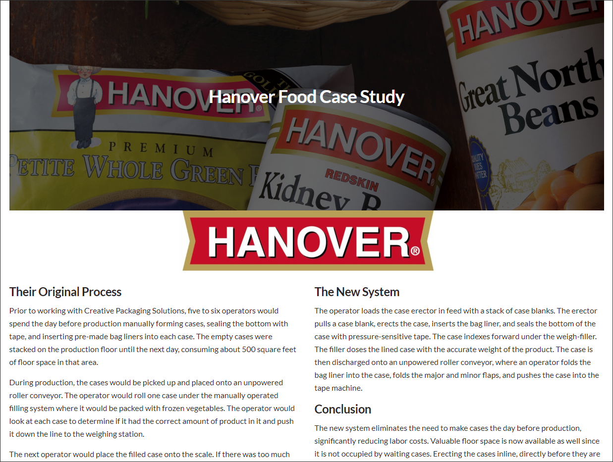
Case studies
Next, we included case studies so that we could show real-world examples of how Creative Packaging Solutions solves your problems.
Takeaways
Your takeaways from this example, I want to think about your potential customer what they care about, and what's the problem that you solve. Remember, make it interesting, keep your copy clean and simple, and don't fill it with meaningless, corporate blah, blah, blah.
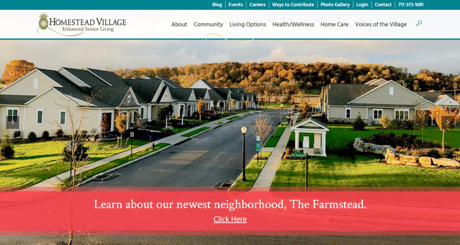
Homestead Village Example
My final example is Homestead Village. They're an upscale retirement community right here in Lancaster County. Their website looked great, but with an older target audience they were concerned about all the new ADA compliance.
ADA Compliance
You might be wondering what does the Americans with Disability Act have to do with websites? Well some people have mobility issues, maybe using the mouse or maybe they have some visual issues that they can't see the screen as much, and we want to make sure that all users can have a great experience looking through your website.
Color contrast
One of the biggest factors in ADA compliance is color contrast. People who have visual impairments might have trouble reading the text if there's not enough contrast between the text and the background.
BEFORE
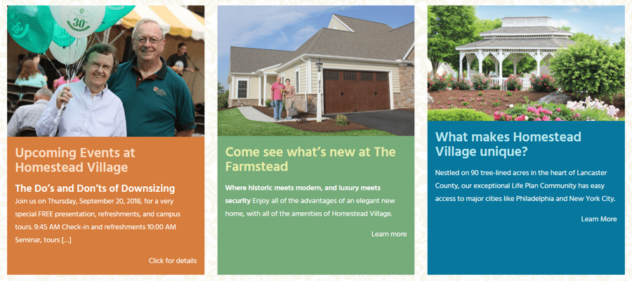
You can see on the screen that the light color headlines on the backgrounds might be difficult to read.
AFTER
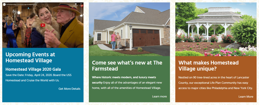
And now we've changed it so that there's a lot more color contrast to make this much, much easier.
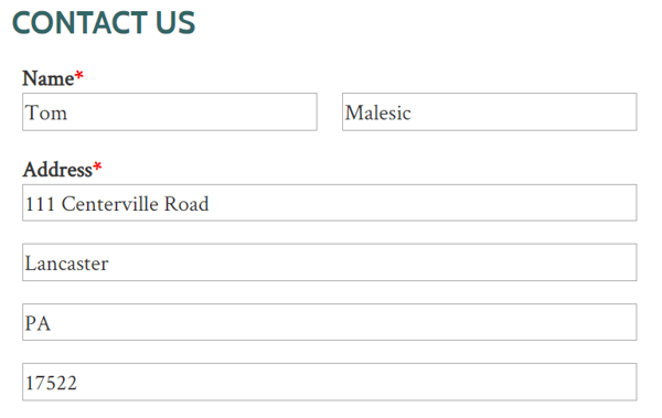
Forms
Forms can also be a problem for ADA. Many people that have mobility issues are going to use the tab or the space-bar to go from field to field, and if they're not labeled cleanly, it might be challenging to know exactly what you're filling in.
BEFORE
AFTER
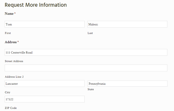
So here's an example of the way it was before, and the way we changed it to. Now the fields are labeled consistently, so that it's clear what information goes in what box.
Takeaways
Your takeaway from this is that ADA has really become the new mobile-friendly of website design. You have a lot of potential risks and we want to make sure that you don't get a lawsuit because you're not ADA compliant.
Hopefully, now your brain is spinning with ideas. Let us know in the comments below what websites you love and why. If you'd like us to take a look at your website and give you a free review of what you can do to make your website better, click on the button below.

And don't forget to like and subscribe!