Pop-ups, formerly synonymous with spam and viruses, are making a comeback. Studies have poured in indicating significant boosts in lead conversion rates. The numbers are so good that businesses and marketers alike are examining the ghosts of pop-ups past—and considering whether the old tactic might be of some use today.
Whether you’re for or against the marketing device, we’re here to show you the right way to use them if you’re curious enough to try them out yourself. Plenty of marketers are already breaking from the stigma associated with pop-ups and the results they’re seeing is proof enough that vintage is making a comeback.
Determine the type of pop-up that works best for you
There are five common ways to utilize pop-ups on your website: click pop-ups, timed pop-ups, scroll pop-ups, entry pop-ups, and exit pop-ups. Each refers to a specific way of introducing the pop-up, with each having its share of pros and cons. Similarly, not all pop-ups benefit everyone equally.
Click pop-ups
These trigger by an action taken by your visitor, typically when they click on a specific graphic, word, or link. Because they’re prompted by an action, they’re considered the least intrusive type of pop-up.
Timed pop-ups
By timing a pop-up to trigger 10, 30, or 60 seconds after a user visits a page, you can target visitors who are likelier to be engaged by your content than those who aren’t.
The timing can be adjusted according to your preferences, but the goal is to give users enough time to acclimate themselves to your content before spooking them with a pop-up. And if a visitor has been browsing your site for some time, you want to trigger the pop-up before they get bored and wander off.
Scroll pop-ups
If your goal is to target visitors invested in your content, then a scroll pop-up may work for you. You can set the parameters of this pop-up to trigger after a certain percentage of the page has been scrolled, giving you a stronger chance to make your case to those actually interested in your page.
Entry pop-ups
These are the pop-ups of old—the ones triggered once a website or landing page has loaded. These can actually be invaluable when used right.
Try out limited-time offers or exclusive deals and promotions when using entry pop-ups. They border on the sales-y, but if you’re offering something of real, immediate value then your visitors are less likely to think twice about opting in.
Exit pop-ups
Ideal for giving visitors one last chance to follow your call to action, exit pop-ups trigger right as your visitor is preparing to leave. These pop-ups know your visitor is on the fast-track out of there by tracking their mouse movements, cursor directionality, and velocity. If their cursor skirts close to the tiny x in the top right corner or over another tab, the pop-up kicks in.
Exit pop-ups make users pay attention so make them count. Utilize them on different pages by using a different one on each page. You can set them to appear a maximum number of times per week to prevent your pop-ups from turning into spam.
The way to pop-up success
As consistency, a compelling call-to-action, and timing are important to copy, so too are they vital in a successful pop-up. Once you’ve tested and measured how the various pop-ups work for your website, remember that they should be an extension of your brand.
Be consistent
Pop-ups shouldn’t alienate your customers or make visitors feel as if they’re suddenly on another website. Font, colors, and layout should reflect your website to make the appearance of the pop-up as pleasant as possible. It should be familiar to the visitor, never disruptive or gauche.
Use strong (but brief) calls to action
Make your calls to action to-the-point and powerful, and time them right; because once you know your audience, you’ll have a better understanding of when they need that extra nudge, which is where a pop-up comes in handy.
Show your appreciation
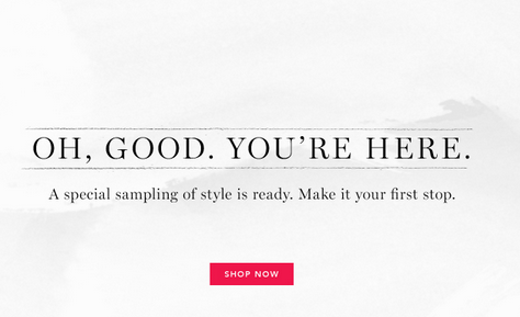
If the pop-up works, celebrate; thank prospects when they opt in by acknowledging the completion of the form. A confirmation pop-up on Rue La La lets the user know their information was submitted in a clear and friendly way.
Conclusion
For pop-ups to work today, they need to be subtle and smart—catered to the behavior of your average visitor. Most important, pop-ups need to be backed by stellar copy, and employ intelligent marketing tactics.
To help you decide which pop-up is right for your website and targeted audience, please contact us to further discuss.

