When you walk into a store, restaurant, or any type of business, what are some of the reasons you find yourself not sticking around? Is it the lack of cleanliness, the poor layout design, or maybe the disgruntled employees that refuse to help? Whatever the reason, we’ve all likely had a bad experience at a business that left a sour taste in our mouths and kept us from returning.
Now imagine if people had that same feeling when coming to your business’s website—scary, right? What’s even worse, is that you may not even know that it’s happening or how it’s negatively impacting your business.
Most of the time, business owners don’t know what makes a website design have good or bad functionality. As a result, website user experience (UX) is often lost on businesses if they haven’t done the proper research. That’s why our web design company is here to help. Not only will we shed some light on website user experience, but we’ll also talk about ways to improve it and show a few examples.
What is Website User Experience?
To put it simply, UX is the overall experience that a person has when visiting your website and how enjoyable it is for them to use. User experience can apply to all types of interactions (businesses, products, software, etc.), but in this case, we’re specifically looking at website user experience. Not to be confused with User Interface (UI)—which focuses more on graphics and the “look” of your website—UX is a much broader topic. In the end, your website design may look great, but if it doesn’t have the content the user is looking for, they may still end up leaving dissatisfied.
What Makes For a Good Website User Experience?
User experience factors in several elements of your website design that make up its entire interface. From the ease of navigation, down to the type of font you use, users will subconsciously take all of this in before deciding to stay on your website. The process of building and collaborating all of these factors is what we call user experience design. Creating an engaging website design is necessary for the success of your business, so understanding user experience web design is just as important. Here are a few questions you’ll want to ask yourself about the user experience on your website design:
- Is it easy to use? Your website design should be simple to understand and to navigate. Users shouldn’t have any problems finding the information that they’re looking for and they shouldn’t have difficulty clicking on anything.
- Does it solve a problem? Your website design should identify who you are and how you can help them. You want to make sure it’s clear that you understand your audience and provide a clear path with CTAs to help them navigate.
- Is it attractive? This goes without saying, but UX best practices also means your website design needs to be aesthetically pleasing. That means your page makes effective use of white space, typography, has a visual hierarchy, and all around is pleasant for your users to look at.
- Does it function well? Good website functionality goes beyond just “my website works.” It also means that pages load quickly, that images don’t take forever to show, that it’s mobile-friendly, has no broken links, etc.
How to Improve User Experience on Your Website design
In our web design guide, we talked about a few ways you can improve user experience of your website design. These tips included using good web design principles, keeping your website design simple, having effective navigation, creating a clear path for your customers, making contacting you easy, optimizing your page speed, and above all else, being mobile-friendly web design. The best part? You don’t have to be a UX expert to start making most of these changes with your website design.
If you’re not sure where to start, try asking your users or customers what they do or don’t like about your website design. Getting feedback from a real user is a great way to start implementing these UX best practices into your website design. Also, make sure you take the time to ask yourself what you like or dislike about other web pages as well. Taking notes of a few “dos and don’ts” from other website designs can help you improve your own user experience and make plans going forward.
Some of the best instances of website user experience comes from looking at real-world small business examples.. Let’s take a look at a few before and after shots of our clients’ websites where we’ve helped improve user experience.
Precision Coating Technology
Before
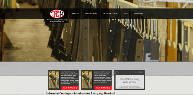
Any website design should quickly answer three questions: who are you, why should I care, and what do you want me to do?
While Precision Coating's old website design clearly had something to do with metal, it wasn't immediately obvious what they did or how it would help the visitor, without scrolling further down the page. It also needed stronger calls to action to encourage people to dig deeper into the site and their capabilities.
Beyond that, the website design was beginning to show its age with missing elements, old pictures and web design issues that made it look outdated.
Precision Coating needed a refresh that would give them a modern look and make the site easier for visitors to understand and find solutions.
After
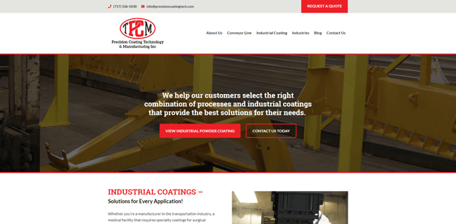
What a difference a UX design can make, right? Starting with the homepage, we organized the content on the site into clearer sections so it was more easily navigable. Being a niche service, it was important to understand and anticipate the user’s needs. This web design was focused around making it easy for the user to learn more and access the information they were looking for..
The new website design also strategically directs users to a new “Request a Quote” page. Here, we included a form that serves the user with a series of questions and choices that better help Precision Coating provide an accurate quote to potential customers.
While the old site lacked visual interest and examples of their work, Precision Coating’s new website design includes a variety of photos giving users a behind-the-scenes look into their warehouse. The site also now shows photos of how their coatings can be used across different applications and industries.
Takeaways
- Provide strong call-to-action (CTA) buttons on your homepage that clearly direct your customers where you want them to go.
- Use sharp, clean images and design to make your website design more aesthetically appealing to your users.
River Valley Recreation
Before
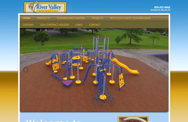
At first glance, this website design might not seem too bad. Sure, the aesthetics are a bit outdated, and there are a lot of options in the navigation, but those aren’t the worst hindrance to user experience.
What you can’t see is that the majority of these navigation links were going out to other websites. In other words, River Valley was actually funneling users away from their website design. While these links were useful for showing all the different products they offered, they made the user experience inconsistent and prevented River Valley from effectively generating leads.
River Valley’s old site was also missing the opportunity to highlight their strengths as an all-inclusive company. Prior to the site EZMarketing built, River Valley was missing information that led to them being an all-inclusive company. From designing playsets, to installing playgrounds, and maintaining the equipment, River Valley does it all—but that information was nowhere to be found. Remember: good website user experience helps solve problems for your customers. By clearly explaining your services and their benefits, you can create a better experience for your website users.
After
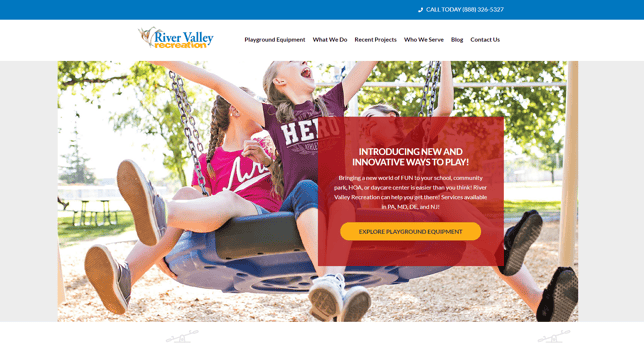
The first redesign aspect that we tackled was reorganizing the navigation to the site. We took all of the previous outbound links on the site and summarized them into new content pages. As a result, we were able to keep customers on the River Valley website and improve the overall content on the pages. Reorganizing and relabeling items in the navigation also helped the user to find what they needed a lot more quickly than before.
Since River Valley’s main objective for the site was to gain new customers, we added clear call-to-actions on each page that directed users to the contact page. If a potential customer was ready to get started or get a quote, there was no confusion about how to contact River Valley. We also broke up large paragraphs (which would traditionally be more difficult to read) into sections, with photos, videos, headings, and bulleted lists that guide the user to the most important information on each page.
Takeaways
- Improve the aesthetics and overall look of your page to start implementing UX best practices for your business.
- Make sure you’re telling users what you do and how that can help them solve their problems.
- Create clear navigation and avoid sending potential customers to other websites with an overabundance of outbound links.
Blessings of Hope
Before
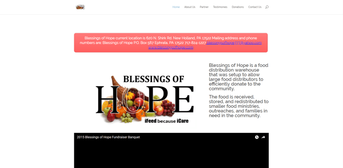
Blessings of Hope is a non-profit food bank that really wanted to grow its organization and donations so they could hire more staff and expand their reach. As a very basic website, the old Blessings of Hope webpage did not contain a lot of content. There were no CTAs on the main page, it wasn’t very mobile-friendly, and the visual design was not attracting the donations or awareness that the organization needed.
In addition, the page was originally living inside of another website design. It needed to be separated to establish its own identity and help increase fundraising.
After
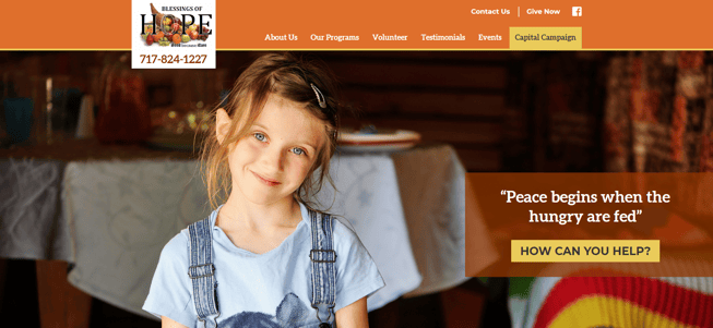
With a fresh (and mobile-friendly) new website design, users are able to easily navigate through the site. With clear CTAs and a more defined navigation system, it’s much easier to find out how to volunteer or donate to the organization. In addition, it’s much easier to understand what the organization does in a more consumable format.
More content and pages were also added (FAQs, a blog, program pages, a volunteer page/form, testimonials, events, etc.), which is always helpful for increasing Google rankings.
Takeaways
- Add more content and pages to your website design to improve user experience by providing them with all of the desired information.
- Clearly identify your audience and goals and how your organization can help.
So now that you’ve seen a few examples of what good user experience on websites can look like, what are you waiting for? No matter what your main goal is, working with EZMarketing, a Lancaster-based web design company, to improve user experience and to implement UX best practices is…well, EZ! Feel free to contact us with any questions about user experience, websites, or about marketing in general.

