Designing a great logo is a little bit like coming up with the perfect recipe. All the right ingredients have to be combined with precision to make something more appealing than the ingredients on their own.
After 30 years of doing graphic design, I've learned that developing a recipe perfect for any business isn't easy. But I've also learned that, by following some rules of thumb, the chances of designing a successful logo that communicates a brand's identity are improved. Here's my master list of do's and don'ts when designing a logo.
When designing a logo, DO:
- Do your research and find out information about the business you're designing a logo for. Ask plenty of questions about what they like or don't like, including colors, competitors' logos, graphical elements, and more. You'll be more successful when you understand the needs of the business. See what types of logos are out there already in relation to their type of business.
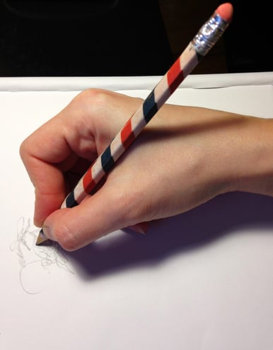
- Take some time to draw. Sketching ideas is the best way to start the design process as opposed to working directly on the computer. You can more quickly determine what may or may not work - it's the first step in creating something unique and eye-catching.

- Think about typefaces and fonts. A distinctive font or treatment in the business's name or acronym makes it memorable. Don't overload it with too many fonts - use two at the most. (Generally, keep the font readable. Crazy or trendy fonts may be short-lived.)
- To the prior point, try to create something that will stand the test of time, not look too dated. You want to develop a graphic that symbolizes what the company does and make it easily recognizable without going overboard. Remember, the audience will need to connect with the logo for a long time.
- There are so many logos created every day in the industry that it’s a challenge to be distinctive. With that in mind, a logo shouldn't be too busy. Simple is best.

- Create something that's adaptable to different formats. Your logo should be readable when small, should work well in black and white, should have the ability to be reversed on dark backgrounds, may need to be flexible for vertical or horizontal use, and needs to work both on paper and screen.
- Creativity is not always a controllable process, but stay within the agreed-upon budget throughout the job if at all possible. Both you and the client will be happier as a result.
- Show how the final logo can be used on vehicles, signage, or anything else that may be helpful in letting the client see how it works.
When designing a logo, DON'T:
- Don't ignore the industry. Your logo should fit with the type of business the client is in. After all, how could a funeral home be taken seriously with a logo designed with bright colors and a grunge font?
- Although it's not always easy to do, don't incorporate elements that have been over-used in either the design world or the industry that you're designing for. While you want some sense of familiarity, your design needs to be unique to the business that hired you to develop it.
- Don't completely toss out the existing color palette of the company you're working with. If they have an existing color palette, incorporate it into the new design, possibly with some additional colors to consider that may compliment their existing scheme.

- As a counterpoint, don't be married to the existing color scheme, either. Provide variations you may feel strongly about that the client may not have considered. Take it in a different direction, go off the board, and then present your new designs as options to consider. The client may love the new direction!
- Don't forget the psychology behind colors. Colors have meaning and connect with people in how they are used. For example, a muted pattern communicates sophisticated and subdued. Brighter colors should be used in bolder designs. Blue is professional and calm whereas red is powerful, energetic, and warm.
- Interact with the client, but don't let them control the process. Some try to micro-manage and get picky about insignificant things to the point of blowing the budget and creating something off the mark. Small budgets should not allow for numerous revisions and additional options. If they're paying for a Yugo, they shouldn't get a Cadillac.
- Don’t send the logo in only one format. Various file formats such as JPEG, PDF, and EPS (created as RGB, CMYK, high-res, low-res) should be provided to the client to suit their needs.
One final note: you won't yield your best results until you've practiced logo design for some time. So don't give up! The more you design, the better you'll get - and these guidelines become intuitive as a result.
