Video Transcription:
What are some common web design mistakes, and how do I avoid them?
Some of the most common web design mistakes we see are the ones you don't even realize that you're making. They seem like normal things that you see on other small business websites, but what you don't realize is they can really hurt the user experience and effectiveness of your website design.
To find out what they are, keep watching.
You may have noticed that I'm not Tom, but after 50 episodes of Ask EZ, I thought we'd give him a little bit of a break.
I'm Kevin Quartz, Director of Web and Print, and you're watching Ask EZ. This is where small business owners go to get real
answers to their marketing questions.
We've helped design hundreds of small business websites,
and most of the design mistakes that we see fit into two basic categories.
1. Function vs. "Fluff"
The first is what I call Function vs "Fluff". This is when you add fancy features to your website that actually hurt the functionality. Here are a few examples:
Sliders
Sliders: sliding pictures that you have on your homepage or sliding testimonials that you have on your website design. I mean, lots of websites have them. What's wrong
with those?
The problem is they frustrate users and they just don't work. People read at their own pace, and often sliders are either too fast or too slow.
Also, studies show that only one percent of users actually click on the slider. Plus, they slow down your site and often they're just not mobile-friendly.
Clever navigation
Another example of "fluff" is clever navigation. People often try to switch up the navigation and either put it on the side, or they try to hide it.
Putting it horizontally across the top of the page seems boring, but it actually works because that's where people look for it.
So keep your navigation at the top of your website design, and you'll make it easier for people to use and navigate your website.
Always focus on making things easier for your
website visitors. Avoid using "fluff" that ruins the user experience.
2. VIsual Overload
The second category of web design mistakes is visual overload. That's when you have so many things going on visually that it takes away from your core message.
Visual overload can come in many forms, but here are a few common mistakes.
Too much stuff on the homepage
I get it: your homepage is valuable real estate, and you want to cram in as much as you can on there because your company does so many wonderful things.
But when you have too many things on your home page, then nothing stands out, and nothing is important.
Fewer things and more empty space on your home page makes your page easier to read and easier to understand.
Huge blocks of text
Next, huge blocks of text. A lot of text can be really intimidating for users. They'll either skip over it or leave your site entirely.
Instead, make your site really easy to read. Shorten your sentences, or just use bullet points. Use photos to break up text, and use fonts that are really easy to read.
Bad color contrast
Lastly, bad color contrast. This one is often overlooked, but having a bad color scheme is often distracting for the user.
If there's not enough contrast between colors, your website can become hard to read. It can be harder to find buttons or calls to action.
Take a look at the two examples below, and see which one is easier to read.

At the end of the day, we want to minimize visual distractions. We want to make the website easier to read and understand.
If you want to learn more about how to improve your website design we have an upcoming webinar that you won't want to miss. If you can spare just 11 minutes out of your day click below to watch the recording.
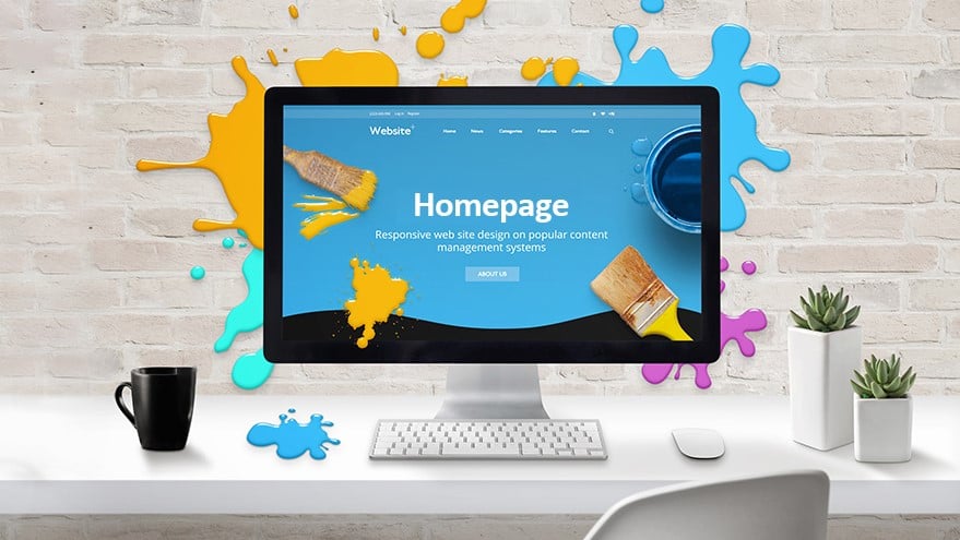
8 Essentials for a Better Homepage
Recording from Thursday, October 15, 2020
If you can't, take two seconds: subscribe to our Youtube channel, where you'll find a lot of great videos.