If your website irritates visitors, they're not likely to stick around very long - and since bounce rate is a ranking factor, you'll certainly want people who find you on the web to stay on your site for more than ten seconds. But what exactly qualifies as "annoying"? Here are five of the major site features likely to cause visitors to your website to leave in a flash.
Audio or video that plays automatically
Have you ever been listening to music on your headphones only to open a webpage that blasts your ears with a message you didn't ask for? Of course you have - we all have. It's no fun trying to scramble around searching for a way to silence the noise, so visitors to sites with this irritating feature are likely to close the window and take their search elsewhere.
Even though just about anyone would agree that they don't like auto-play videos and music, the logic behind their use seems to make sense. It's a way to grab someone's attention from the get-go in the hopes that they'll hear something they'll want to learn more about. In practice, though, it just doesn't play out this way.
Think about it from a customer experience perspective: it's not only potentially alarming (to put it mildly), it's also impolite not to let them choose what content they want to consume. There are far better ways to engage them.
Pop-up ads, calls to action, forms ... and anything else
There's a reason a pop-up blocker is one of the web's most popular extensions. People just don't like pop-ups, period. Their appeal is similar to the above. It seems like getting right in front of the visitor is the best method of getting them to take action, and in a way it is - it's the best method of getting them to take the action of leaving your site.
One of the main reasons not to use pop-ups, though, was alluded to above. Pop-ups can be blocked. If you want to share vital information, generate leads, advertise, or anything else you might be trying to accomplish through pop-ups, there's likely a far better way to accomplish the task. After all, if the visitor can effectively hide information that you want them to see, you won't just annoy them. You'll lose the ability to convert.
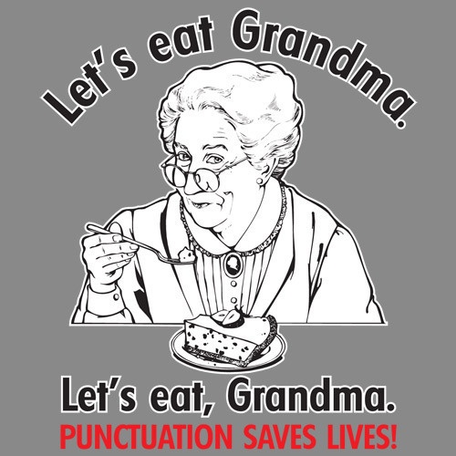
Grammar mistakes
A UK poll found last year that grammar mistakes on websites scare users away. This comes down to professionalism, especially for content marketing companies. If your website is full of grammar mistakes, can you be trusted to provide high-quality products and services? People seem to think not.
Now, for websites that don't deal specifically with grammar-related products or services, why is this such an issue? After all, one might argue that the average site visitor won't take notice. Unfortunately, that's not the case. An analysis of online sales figures found that a single spelling error - just one! - can cut online sales in half.
Treat your website as a sales person: professional, friendly, and of course, a great communicator. If you're not equipped to write website content that you're sure is 100% error free, hiring someone to do it for you can actually offer you savings.
Just remember, grammar can save a life.
Poor navigation
Visitors to your site will leave in a hurry if they can't figure out how to get around. Poor navigation design is one of the worst ways you can turn potential customers away. Once again, it's painfully obvious that clear and intuitive navigation is key for a website that wants to convert - so why do so many sites still feature awful navigation like this?
The fact is, navigation design is anything but intuitive and requires a lot of skill. The individual responsible for designing a navigation bar needs to evaluate a site's information architecture, use simple terms that won't confuse visitors, and create something that's aesthetically pleasing. It's tough work that, once again, may require the help of a design pro - but it'll be worth it in the long run.
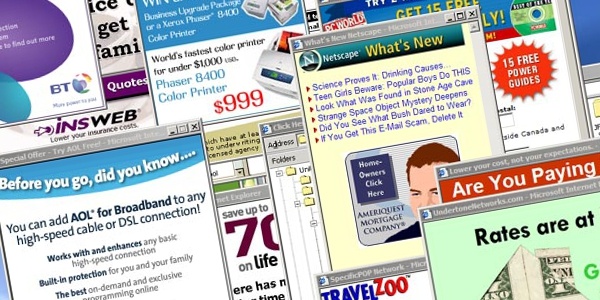
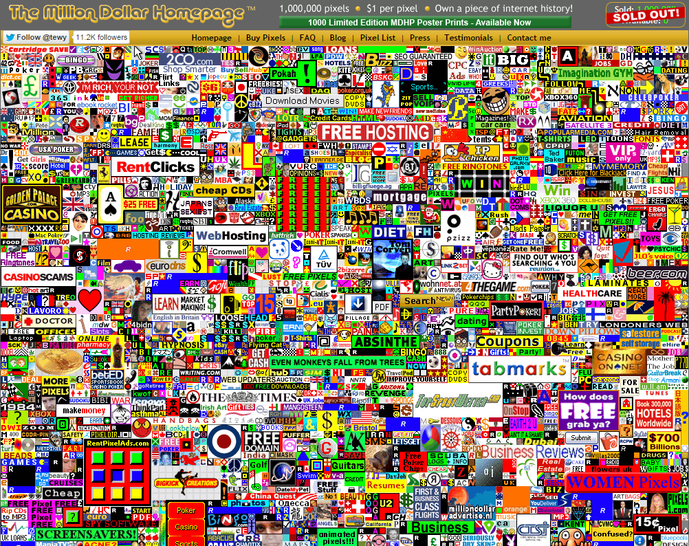
Ads, ads, ads
Many websites are paid for in whole or in part with advertising revenue. However, visitors aren't coming to your site for advertisements. They're coming for your products and services. When ads distract the visitor from the main thing - your business - they'll take their dollars to another website that's less cluttered.
Another important point to make is that Google doesn't like websites with too many ads "above the fold," meaning the area a user lands on your site without having to scroll. Google believes that too many ads results in a poor user experience, making ads a factor that can negatively affect SEO.
Keep your brand in the forefront of your potential clients' minds and stay away from ads that distract from your brand's message, or ones that are visually unappealing. Don't run so many ads that your website becomes cluttered. And be aware that making more money with ads could well mean losing money for your business.
Lastly, you want a website that you are proud of so make sure you get a professionally designed website to avoid making these mistakes. Our website design and development company in Lancaster produces affordable website design for local small businesses including nearby York and Harrisburg.