What do you think of when you see a logo? The Golden Arches, perhaps, the Nike swoosh, the mermaid on a cup of Starbucks coffee. The power of a logo is not to be underestimated: your logo communicates many, many things about your business. Everything from the typeface to the color to the placement of various elements says something, which is why poor logo design is something to be avoided at all costs.
Here are four things that your logo communicates about your company's branding.
1. I am powerful / playful / subversive / friendly
What is the essence of your business? Is your company powerful? Is it secure? Do you want people to know you strive for quality? Having a logo that represents these principles helps your customers to understand what you do.
For example, think for a moment about typefaces. Coca-Cola has been using a variant of the same logo since the 1880s - always with the same font. Why stick with the same font after all these years? Because it communicates that Coca-Cola is a true classic.
![]()
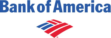
Bank of America's logo is a no-nonsense sans-serif font. The bold letters suggest security. Imagine if the text were written a scrawny typeface - it would completely change the feel of the logo.
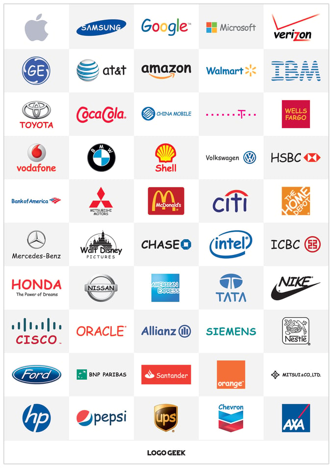
The point is, selecting the right typeface for your logo is critical to its success. Logo Geek made this point abundantly clear when it rendered dozens of world-famous logos in Comic Sans:
2. I am unique
If your logo isn't unique, you will be easily forgotten. A unique logo tells potential customers that you're not like all the other guys. Adding something unique to your logo makes it stand out from the rest and creates a positive first impression.
For example, the playful lettering in the Disney logo is bold and unmistakable - but it's also whimsical and friendly:
![]()
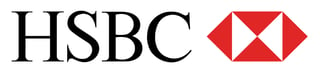
HSBC, a financial services firm, has a logo that looks like a bow tie - appropriate for a company that wants to convey professionalism.
The use of shapes can also convey a sense of uniqueness. These logos, for instance, use triangular shapes to imply balance and a sense of stability.

You'll notice, "unique" doesn't mean "complicated." The most unique logos - Nike, Disney, Apple, Adidas, Twitter - are also some of the simplest.
3. I am current
No matter how great your logo is, if it doesn't evolve over time, it could leave your business looking old and outdated. Even timeless brands like Apple, Nike and Coca-Cola have made subtle changes to their logos over the years to stay fresh and relevant. To make the evolution of your logo easier, avoid incorporating trendy elements that might fade in popularity. Instead, use time-tested colors and simple elements that make it easy to incorporate subtle changes over time.
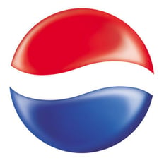
Take, for example, how the Pepsi globe - one of the world's most iconic recognized logos - was updated in 2009:
 Pepsi's old logo
While the logos are similar, the update does a few important things: it takes away the contouring that gave the original logo a sense of depth and updated it to a minimalist, modern and flat disc. While the colors still represent the American flag, their hues aren't as deep as the original logo. In terms of brands with the type of recognition that Pepsi gets, the logo update was pretty dramatic.
Pepsi's update demonstrated their willingness to stay current - even though they could have afforded (like Coca-Cola or McDonald's, for example) not only change their logo subtly.
4. I know who my audience is
Your logo conveys a subconscious message about how you connect with your audience. For example, masculine logos look different than feminine logos.
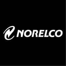
Norelco, a men's razor, is black and uses sharp lines.
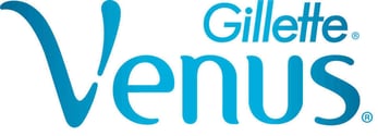
Gillette's Venus razor logo is soft, rounded, and blue, suggesting luxury, smoothness, and water.
Technology companies' logos tend to convey a sense of being advanced, intuitive, and cutting-edge, as a way to appeal to technology enthusiasts and early adopters.
For instance, consider IBM, Apple, and Cisco systems,.
![]()
![]()
![]()
Vertical lines suggest masculinity as well as strength and stability. Horizontal lines suggest community. Notice, too, how Cisco Systems, a company named after San Francisco, has a logo suggestive of the Golden Gate Bridge.
Color also helps to demonstrate a business's awareness of its customer's needs as you can see in this chart on the colors we feel.
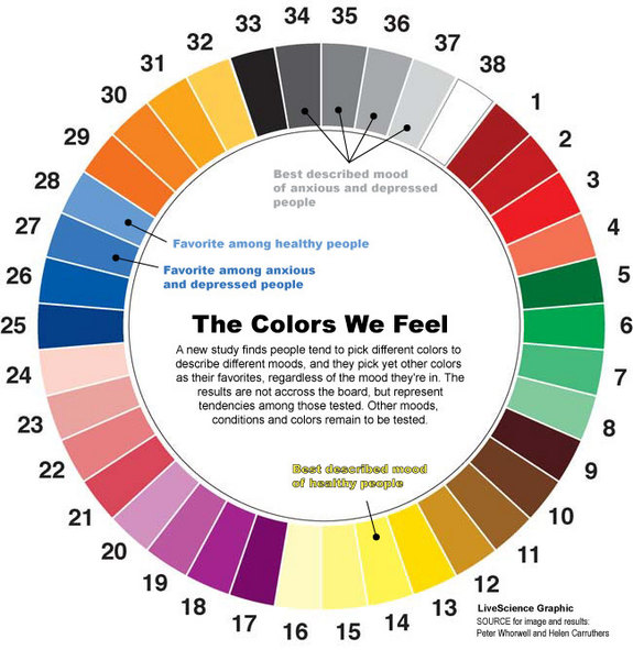
Blue is calm, strong, and trustworthy. Green is natural, organic, caring, and earthy. Black suggests sophistication, authority, formality. The color of your logo has the power to inform your ideal customer that you're the right fit for them, as you can see in this infographic:
![]()
A well-designed logo speaks volumes about your identity before a customer even knows who you are or what you do. As you develop your brand, review your own logo. Are you making a great first impression and connecting with your target audience in an engaging way? If not, it might be time for a new logo design!
![]()