If your logo is a visual representation of your business, then a poorly designed or outdated logo is like suffering an identity crisis. Prospects will lose touch with who you are or what you do. So the question becomes: “how do I know if my logo needs to be updated?” Advertising evolves with consumer and technology trends, so it’s natural to consider whether your logo needs an update. Companies have to adapt to survive, after all.
Logos create a sense of trust, and signal things like quality, value, and popularity. Just consider how consumers treat brand recognition—placing more value on a product’s logo than the product itself.
A recognizable brand is one the consumer is already familiar with, and is one they’re more likely to favor or trust. As a representation of your business, your logo is a key element in your visual branding, one that allows people to form an emotional association with you and your products or services.
Not feeling your logo anymore? Think it’s time for a change? Ask yourself these four questions to see whether your business logo needs a facelift.
1) Does it reflect my company’s brand identity?

Perhaps you’re in the middle of a rebranding or you’re simply not sure if your current logo still communicates, but an important question to ask is whether the logo adequately (and accurately) represents who you are as a business. In other words, your logo should tell your story.
If your brand identity changes, the logo might need to change as well to ensure uniformity of message.
Bottom Line: Consider changing your logo if it doesn't reflect your company's identity or current brand.
2) Does it help me stand out from all the other businesses?
It can be difficult standing out in a crowd of snowflakes, but there are plenty of companies who’ve managed to do just that. Like domain or business names, being unique makes you easier to find and remember.


Some of the most popular brands have the most iconic logos. Apple, Nike, Coca-Cola—consider how ingrained these brands have become in our culture. Their logos often represents an entire category of product in the minds of consumers.
Bottom Line: If your logo is blending in with the rest, it might be time for a new one.
3) How does my target customer feel about my logo?

You might be in love with your logo, but do your customers share that feeling? Maybe it’s your employees who are less than thrilled about the design. Lackluster logos can diminish a company’s visibility and cause prospects to turn toward a more recognizable, visually pleasing design instead.
Take Target's logo, for example. They have something of an edge over other stores because of their easily recognizable brand symbol, which is a logo that can stand on its own without the store's name or other words. It basically speaks for itself.
In a world where consumers favor visuals over words, a logo can make it that much easier—or more difficult—for a brand to succeed if the people love it (or don’t).
Bottom Line: When your employees, customers, or prospects begin to react unfavorably toward your logo, consider changing it up.
4) Does my logo work across all channels, from print to digital?
There are plenty of companies that got their start before the digital age. That means their logos weren’t originally optimized for the web, so over time they probably realized that the tried-and-true logo didn’t look too great online.
As computer technology improves, outdated graphics start to show their age. Low resolution, bad colors, and poor choice of fonts can render an otherwise attractive logo ill-suited for use across media large and small.
For a logo to really shine it should be viewable on all channels without being turned into a pixelated blob. When your company has a logo usable online, in print ads, social media, and billboards, you’ll have a logo that can endure. It won’t matter where your customers see your logo: they’ll recognize it and know it’s yours.
Bottom Line: Look for a new logo if you’re an older company whose logo was only designed for use in print, or if your logo doesn’t quite look right on other websites and print material.
Conclusion

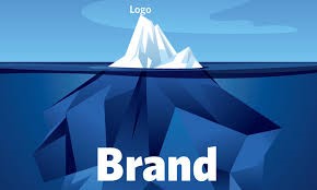
Some logos may only require a small bit of polishing, whereas others could stand to be redone entirely. Either way, your company—your brand—is bigger than its logo; and your logo works for you, not the other way around. Don’t let your business be held hostage by a poorly designed or outdated logo. Our graphic design team has developed hundreds of bold, brand-appropriate graphics to represent our clients’ companies. We can help revitalize your old logo while sticking to the vision that best expresses your business and mission.
