Facebook recently rolled out some changes to its business pages that should make a lot of companies and page owners quite happy. While it’s common practice for the social site to introduce updates to its algorithms on occasion, it is usually done to make pages or feeds more navigable according to user preferences. And this update seems to be no different, so far.
There’s no official word from Facebook for when these changes will apply to every user. Right now, some are seeing the new business page while others are still looking at the previous layout, so this could just be a preview of changes to come. Whether or not it’s the final version is yet to be seen, but if it’s anything close to this then we’re all ready to hit that “Like” button.
Here is what Google's business page looks like with the new layout:
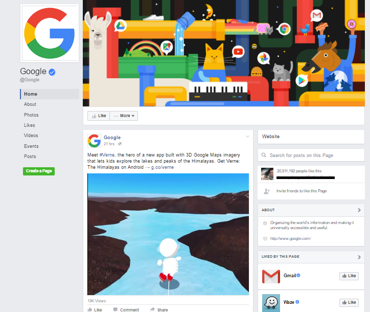
The new business page is like a breath of fresh air in a previously text-heavy, claustrophobic world. The difference between the two versions is nearly night and day.
Digestible page format
One of the first changes—perhaps the most noticeable—is how digestible the new format is. It loses a lot of the sidebar text in favor of a clean column of links, giving each business page more of a mini website feel. The important text such as the about information, number of likes, etcetera, are relocated to the right side for an equally scannable navigation. Other important page tabs are appearing underneath the page logo, improving the navigation by leaps and bounds.
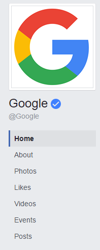 A clean, easy to navigate sidebar (lefthand side) that lists all of the important tabs for this business.
Important buttons are more visible
Visibility is a huge part of the update. Just look at the improved location of the Call-to-Action button (Call Now, Contact Us, Book Now, etc.), which is now located beneath your cover photo, with a more prominent design. Likewise, the “Like,” “Share,” and “Message” buttons have all been moved from the bottom of the page to below the cover photo.
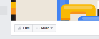 Now these buttons are at the top where they're more visible.
A cleaner look
The best way describe the impact of these changes is “cleaner look.” From the clearer cover photo and the relocation of the page’s profile logo to the left column, to the slight increase of the profile’s size, the new design offers fans and users a clearer glimpse at these important pages.
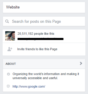 On the right side you can see the business category (website), a search bar, engagement stats (likes, response rate), and the important "About" information.
More control for businesses
Businesses can now choose from one of 27 different business categories, and the category is featured under the CTA button, making it clearer to all users. You can also prioritize and list important tabs and apps on the right, giving businesses the chance to keep the vital ones front of mind for their users. A helpful search bar was placed beneath the category to let you search for posts on your page.
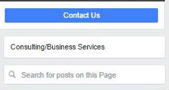 Here you can see the important CTA button (Contact Us) is visible at the top of the page, above the business category and search bar.
Media is more visible
Photos and videos show up beneath the “About” section on the right sidebar now, making them stand out more.
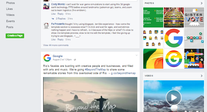 Photos and Videos can be seen on the right sidebar where they can be easily viewed.
We’re pretty excited about these changes and if anything new develops, we’ll be sure to keep you updated. In the meantime, feel free to let us know what you think of the new Facebook business pages in the comments section below.
![]()